April 12th, 2021 - Breaking Changes for All Spark Packages
Summary
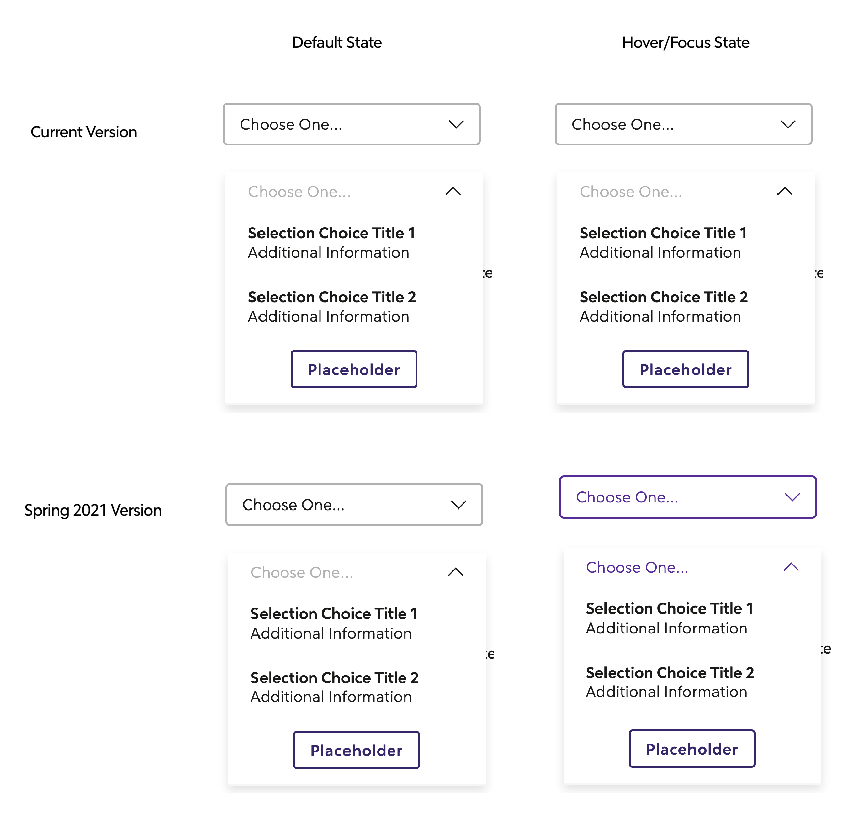
This release has breaking changes for all Spark packages. It includes component upgrades for angular inputs, dropdown, cards, promo and tabs. It also includes link color changes, input color changes and change of location of button call-to-actions inside the components. We removed the pink color and added a new orange.
❗️ This is a very large, breaking release.
Allocate Dev and Design time accordingly and refer to the Upgrade Guide at the bottom of these release notes for project scope.
Package Versions
- Angular: 12.1.1 - > 13.0.0
- React: 4.1.1 -> 5.0.0
- Spark (HTML): 15.1.1 -> 16.0.0
- Styles: 1.1.1 -> 2.0.0
Documentation
Spark Styles
- Removed
sprk-u-Width-100class from the inputs and built in that styling into sprk-b-TextInput. (width: 100%) - Consolidated pink and yellow error colors into orange.
- Pink and yellow are still available as tokens, but will be removed on the next breaking change release.
- Alerts, Inputs and Color Guides reflect this change. Legacy components will also use orange.
- See Color Usage Guide to learn where to use this error color.
- Orange utility classes are also available.
Button
- Updated Secondary and Tertiary buttons to use purples.
- Secondary will have the same silhouette, but purple
- Tertiary no longer has borders, but has styling on hover/focus.
- Removed Quaternary Button and is no longer in code base.

Default Link
- Default state is purple text, purple underline.
- Visited state is purple text, purple underline.
- Hover/Focus/Active state is red text, red underline.

Icon With Text Link
- Styles match Default Link but with no underline.
- Added the link transition to the icon so it animates the same as the text.

Informational Dropdown
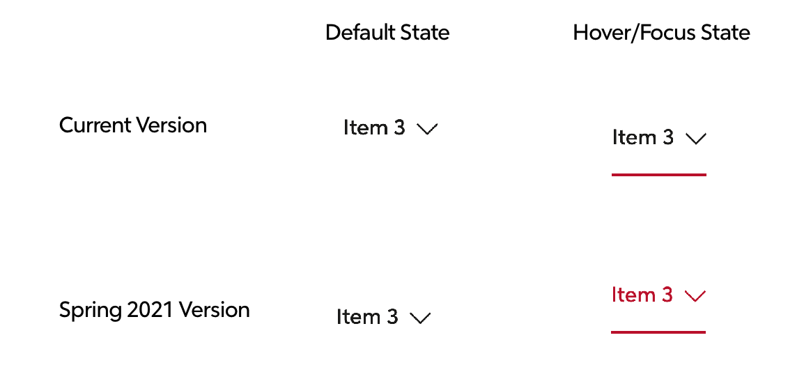
Footer Toggle (Toggle components found inside Footer components)
Masthead
- The Masthead Selector text, border, and chevron icon will turn purple on hover when the selector is open and when it is closed.
- Extended navigation dropdown items will turn red on hover.


Inputs
- Updated colors for default, hover, focus, and error states on all inputs. Includes text inputs, selects, inputs with icons, autocompletes, radios, and checkboxes, including all huge variants.
- Refactors all input borders to be box-shadows.


Angular
Promo (Breaking Change❗️)
Updates the Promo component to accept ng-content and thus making it composition based instead of the current configuration based.
Card - (Breaking Change❗️)
Updates the Card component to accept ng-content and thus making it composition based instead of the current configuration based.
Button - (Breaking Change❗️)
- Quaternary Button is no longer available. Replace all Quaternary Buttons with Secondary or Tertiary Button.
Dropdown (Breaking Change❗️)
additionalIconClassesis deprecated and replaced withiconAdditionalClasses.additionalTriggerClassesis deprecated and replaced withtriggerAdditionalClasses.additionalTriggerTextClassesis deprecated and replaced withtriggerTextAdditionalClasses.titleis deprecated and replaced withheading.dropdownTypeis deprecated and replaced withvariant- variant
baseis replaced withdefault. mastheadSelectorvariant is deprecated and replaced with an internal selector component (sprk-masthead-selector)
- variant
Highlight Board
- Improved documentation.
Masthead
- Extended Navigation: Updated Masthead Selector to have its own CSS Namespace. Padding and color contrast improvements. Note: Former Dropdown Selector namespaces will still work.
Tabs
- The
sprk-tabbed-navigationcomponent is deprecated and replaced withsprk-tabsin an upcoming release. sprk-tabbed-navigation-panelis deprecated and replaced withsprk-tabs-panel.sprk-tabbed-navigation-tabis deprecated and replaced withsprk-tabs-button.- The
defaultActiveInput onsprk-tabbed-navigation-panelandsprk-tabbed-navigation-tabis renamed toisDefaultActiveonsprk-tabs-panelandsprk-tabs-button. - New
Outputonsprk-tabs-button-tabClick.
Tooltip
- Updated how the width is calculated to address a bug on narrow screens where the tooltip was rendering out of the viewport and creating a horizontal scroll.
React
Button (Breaking Change❗️)
- Quaternary Button is no longer available. Replace all Quaternary Buttons with Secondary or Tertiary Button.
- New prop
forwardedRefhas been added to the component.
Card (Breaking Change❗️)
Updates the Card component to accept children and thus making it composition based instead of the current configuration based.
Dropdown
additionalIconClassesis deprecated and is replaced withiconAdditionalClasses.additionalTriggerClassesis deprecated and is replaced withtriggerAdditionalClasses.additionalTriggerTextClassesis deprecated and is replaced withtriggerTextAdditionalClasses.titleis deprecated and is replaced withheading.- Added new events
openedEventandclosedEvent. - Dropdown links can now be rendered as any element, including
react-router-domLinks.
Promo (Breaking Change❗️)
Updates the Promo component to accept children and thus making it composition based instead of the current configuration based.
Highlight Board
- Improved documentation.
- React Highlight Board will no longer throw a console warning if an image is used without
alttext.
Inputs
- Accessibility Bug fix: Spark Inputs will no longer assign an error container ID to
aria-describedbyif the input is valid. - New prop
ariaDescribedBy- any value(s) provided will be included inaria-describedbyon the input.
Masthead
- Extended Navigation: Updated Masthead Selector to have its own CSS Namespace. Padding and color contrast improvements. Note: Former Dropdown Selector namespaces will still work.
Tooltip
- Updated how the width is calculated to address a bug on narrow screens where the tooltip was rendering out of the viewport and creating a horizontal scroll.
HTML
Highlight Board
- Improved documentation.
Tooltip
- Updated how the width is calculated to address a bug on narrow screens where the tooltip was rendering out of the viewport and creating a horizontal scroll.
Masthead
- Extended Navigation: Updated Masthead Selector to have its own CSS Namespace. Padding and color contrast improvements. Note: Former Dropdown Selector namespaces will still work.
🎒Upgrade Guide
ALL PACKAGES (Angular, React, HTML)
Removed sprk-u-Width-100 from the inputs and added width: 100%; to sprk-b-TextInput
- Check inputs that have a
sprk-b-TextInputclass and remove unneededsprk-u-Width-100classes. Ensure layout doesn't change.
Changed Sass Variables
If you're overriding any of these variables, adjust to changes accordingly. See Design Token List for new defaults.
$sprk-btn-secondary-hover-border-color$sprk-btn-secondary-hover-background-color$sprk-btn-secondary-hover-text-color$sprk-btn-secondary-visited-text-color$sprk-btn-secondary-text-color$sprk-btn-secondary-border$sprk-btn-secondary-border-color$sprk-btn-secondary-background-color$sprk-btn-secondary-disabled-background-color$sprk-btn-tertiary-hover-shadow$sprk-btn-tertiary-hover-border-color$sprk-btn-tertiary-border-color$sprk-btn-tertiary-background-color$sprk-btn-tertiary-disabled-border-color$sprk-btn-tertiary-disabled-background-color$sprk-link-light-hover-font-weight$sprk-text-input-error-color$sprk-text-input-error-border-color$sprk-text-input-border$sprk-text-input-disabled-border-color$sprk-text-input-disabled-background-color$sprk-text-input-transition$sprk-input-huge-border-width$sprk-input-huge-box-shadow
Removed Sass Variables
If you're overriding any of these variables, adjust to changes accordingly. See Design Token List for new defaults.
$sprk-btn-quaternary-background-color$sprk-btn-quaternary-box-shadow$sprk-btn-quaternary-border$sprk-btn-quaternary-border-color$sprk-btn-quaternary-text-color$sprk-btn-quaternary-letter-spacing$sprk-btn-quaternary-hover-background-color$sprk-btn-quaternary-hover-text-color$sprk-btn-quaternary-hover-shadow$sprk-btn-quaternary-hover-border-color$sprk-btn-quaternary-visited-text-color$sprk-btn-quaternary-disabled-shadow$sprk-btn-quaternary-disabled-hover-border$sprk-btn-quaternary-disabled-text-color$sprk-btn-quaternary-disabled-background-color$sprk-btn-quaternary-disabled-border-color$sprk-btn-quaternary-disabled-border-style$sprk-btn-quaternary-disabled-border-width$sprk-input-huge-focus-border-width
New Sass Variables
If you're overriding any of these variables, adjust to changes accordingly. See Design Token List for new defaults.
$sprk-autocomplete-results-margin-top$sprk-dictionary-label-color$sprk-black-tint-15$sprk-text-input-focus-box-shadow$sprk-text-input-error-focus-box-shadow$sprk-input-huge-error-border-color$sprk-input-huge-border-color$sprk-input-huge-focus-border-color$sprk-input-huge-focus-box-shadow$sprk-input-huge-focus-box-shadow-disabled$sprk-label-color
Angular Upgrade Guide
❗️Required Work (Card, Promo, Button)
- Card
- All Cards and all the Card Variants will need to be updated using the copy code found on the documentation site: https://angular.sparkdesignsystem.com/?path=/story/components-card--default-story
- Promo
- All Promos and all the Promo Variants will need to be updated using the copy code found on the documentation site: https://angular.sparkdesignsystem.com/?path=/story/components-promo--default-story
- Button
- Quaternary Button is no longer available. Find every element with
sprkButtondirective and replace any that hasvariant="quaternary"withsecondaryortertiary. - Search for elements with
sprkSpinnerdirective, and change its variant toprimaryorsecondary, whichever matches text color of the button.
- Quaternary Button is no longer available. Find every element with
Styles
- Find anywhere in your project you're manually using yellow or pink to indicate error. Replace with
$sprk-orange.sprk-u-Color--yellowsprk-u-BackgroundColor--pink$sprk-yellow$sprk-pink
sprk-dropdown
- Rename all instances of
additionalIconClassestoiconAdditionalClasses. - Rename all instances of
additionalTriggerClassestotriggerAdditionalClasses. - Rename all instances of
additionalTriggerTextClassestotriggerTextAdditionalClasses. - Rename all instances of
titletoheading. - Rename all instances of
dropdownTypetovariant
sprk-tabbed-navigation
- Replace all instances of
<sprk-tabbed-navigation>with<sprk-tabs>. - Replace all instances of
<sprk-tabbed-navigation-tab>with<sprk-tabs-button>. - Replace all instances of
<sprk-tabbed-navigation-panel>with<sprk-tabs-panel>. - Rename all instances of
defaultActiveonsprk-tabbed-navigation-taborsprk-tabbed-navigation-panelwithisDefaultActive.
React Upgrade Guide
❗️Required Work (Card, Promo, Button)
- Card
All Cards and all the Card Variants will need to be updated using the copy code found on the documentation site: https://react.sparkdesignsystem.com/?path=/story/components-card--default-story - Promo
All Promos and all the Promo Variants will need to be updated using the copy code found on the documentation site: https://react.sparkdesignsystem.com/?path=/story/components-promo--default-story - Button
- Quaternary Button is no longer available. Find every
SprkButtonand replace any that hasvariant="quaternary"withsecondaryortertiary. - Search for
SprkSpinner, and change its variant toprimaryorsecondary, whichever matches text color of the button.
- Quaternary Button is no longer available. Find every
Styles
-
Find anywhere in your project you're manually using yellow or pink to indicate error. Replace with
$sprk-orange.sprk-u-Color--yellowsprk-u-BackgroundColor--pink$sprk-yellow$sprk-pink
-
New modifier for Promos was added to allow them to go
max-width: 100%,.sprk-c-Promo--full
SprkDropdown
- Rename all instances of
additionalIconClasseswithiconAdditionalClasses. - Rename all instances of
additionalTriggerClasseswithtriggerAdditionalClasses. - Rename all instances of
additionalTriggerTextClasseswithtriggerTextAdditionalClasses. - Rename all instances of
titlewithheading.
HTML Upgrade Guide
❗️Required Work (Button)
- Button
- Quaternary Button is no longer available. Find every element with the class
sprk-c-Button--quaternaryand replace withsprk-c-Button--secondaryorsprk-c-Button--tertiary. - Search for elements with
sprk-c-Spinnerclass, and change its modifier class tosprk-c-Spinner--primaryorsprk-c-Spinner--secondary, whichever matches text color of the button.
- Quaternary Button is no longer available. Find every element with the class
Styles
- Find anywhere in your project you're manually using yellow or pink to indicate error. Replace with
$sprk-orange.sprk-u-Color--yellowsprk-u-BackgroundColor--pink$sprk-yellow$sprk-pink
Masthead Extended
- This is all contained in the
divwith the classsprk-c-Masthead__selector-dropdown- Find
sprk-c-Dropdownclass and remove it. - Find
sprk-c-Dropdown__headerand replace withsprk-c-Masthead__selector-dropdown-header. - On any
aelements within asprk-c-Masthead__selector-dropdown-headerelement, add thesprk-c-Masthead__selector-dropdown-header-linkclass. - Find
sprk-c-Dropdown__titleclass and replace withsprk-c-Masthead__selector-dropdown-title. - Find
sprk-c-Dropdown__linksclass and replace withsprk-c-Masthead__selector-dropdown-links. - Find
sprk-c-Dropdown__link sprk-u-ptmclasses and replace withsprk-c-Masthead__selector-dropdown-link. - Find
sprk-c-Dropdown__itemclass and replace withsprk-c-Masthead__selector-dropdown-item. - Find
sprk-c-Dropdown__footer sprk-u-TextAlign--centerclasses and remove it. Addsprk-c-Masthead__selector-footer. - For more context, see this diff of masthead stories.
- Find

