-
Notifications
You must be signed in to change notification settings - Fork 0
Example 2: Display nodes as pie or donut chart
You can display nodes as pie charts as long as the proper node attribute exist, that is, a column of type list, where the values are separated by ´,´.
An example can be the case when you want to represent the expression of a protein in 3 conditions. In these cases, the attribute is not simple but a list of values (concretely 3 values, one per condition). See the following files to have an example:
- example: Network Small network of human proteins.
- example: Node attributes Table with attributes relative to the proteins (nodes). The first column contains the protein identifier, the second the cellular location (as single string) and the third the gene expression measured at three times (as list of numbers separated by ',').
To learn more about how to create attributes and the types go to Attributes and types section.
##Creating pie and donut charts
Once you have the attribute in the correct format, go to the Visualization settings box and chose the visual parameter to configure and attribute. The visual parameters that work with lists are color, size and area for the pie charts and stroke color, stroke size and stroke area for the donut charts.
See how we configure the size, color and area of a pie chart using the attribute times of the examples showed in the above section. The attribute time is a list of three numbers. Then, wen configuring the visualization you have first to select the attribute, then tell Cellmaps its nature (categorical or continuous) and finally whether is simple or a list.
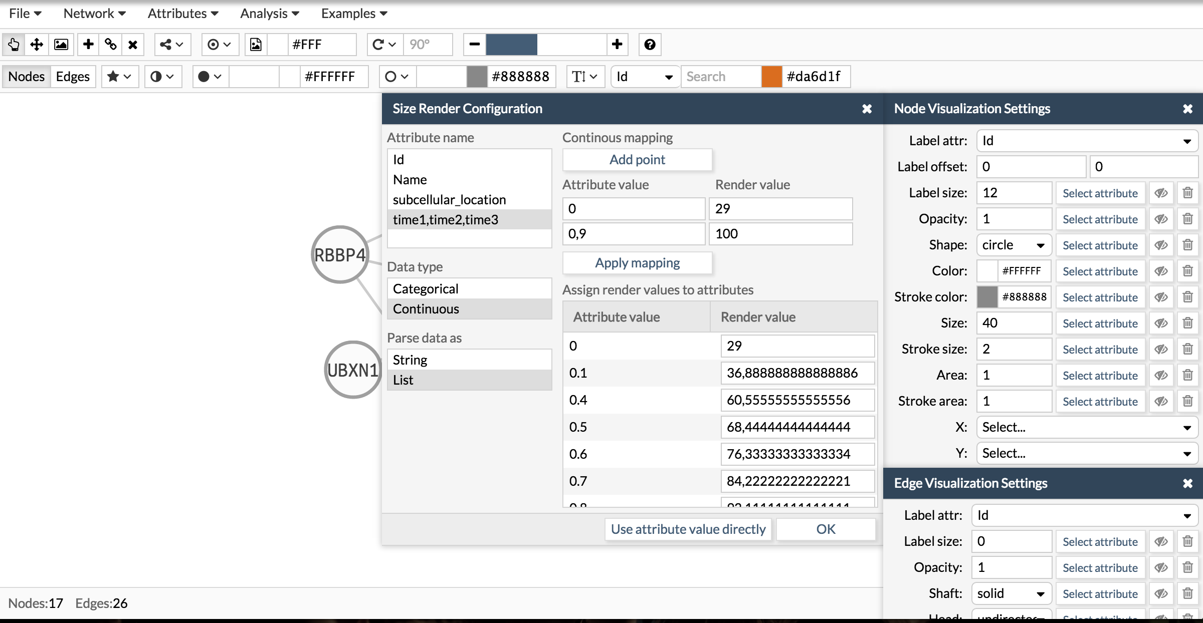
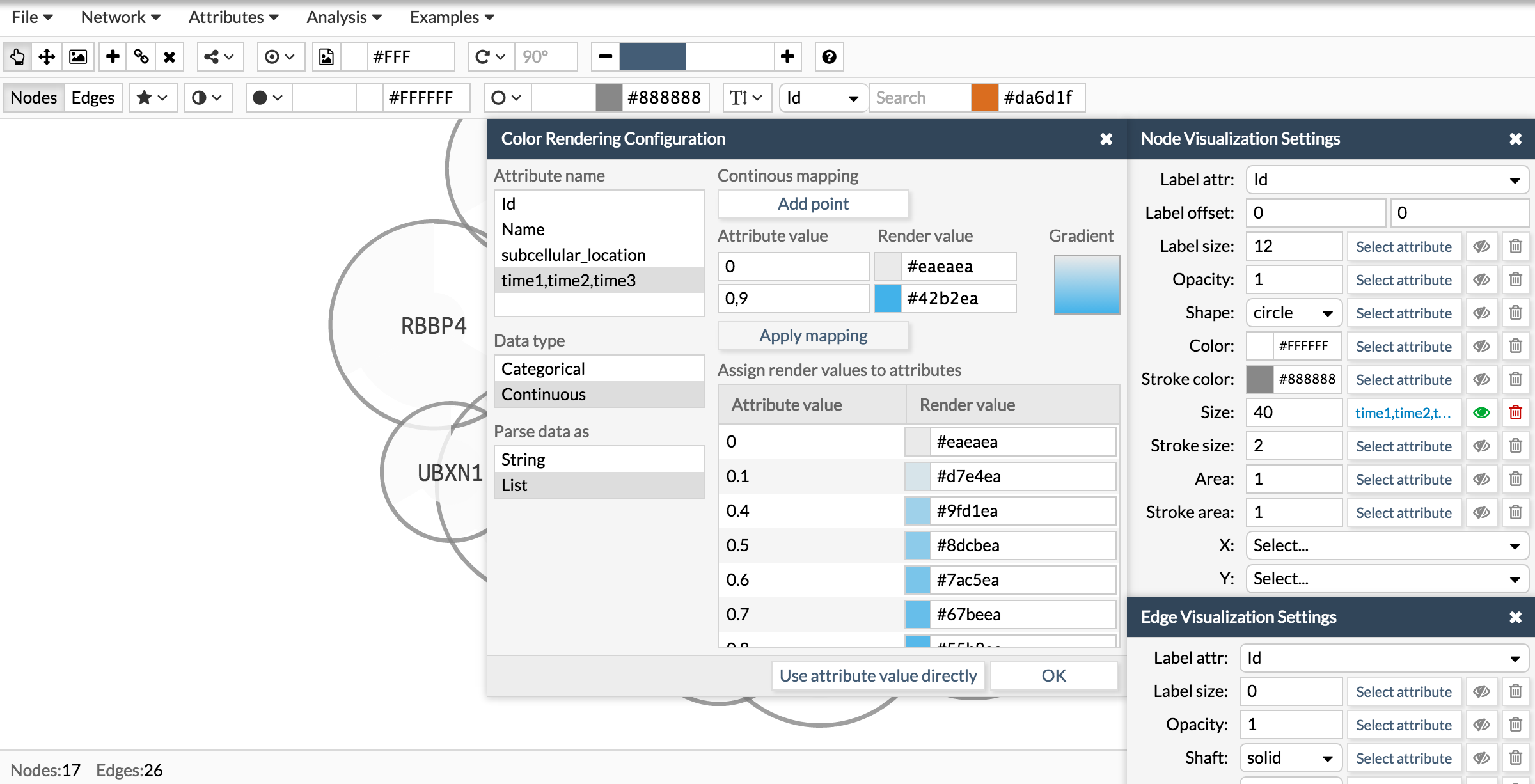
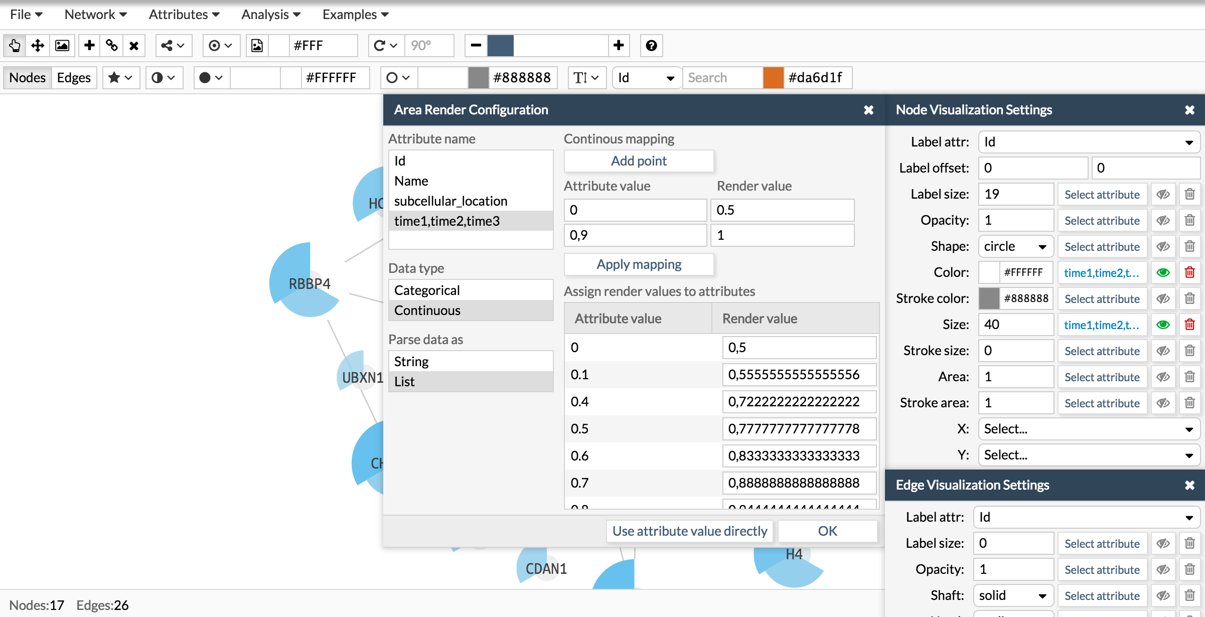
Here you have the final result:
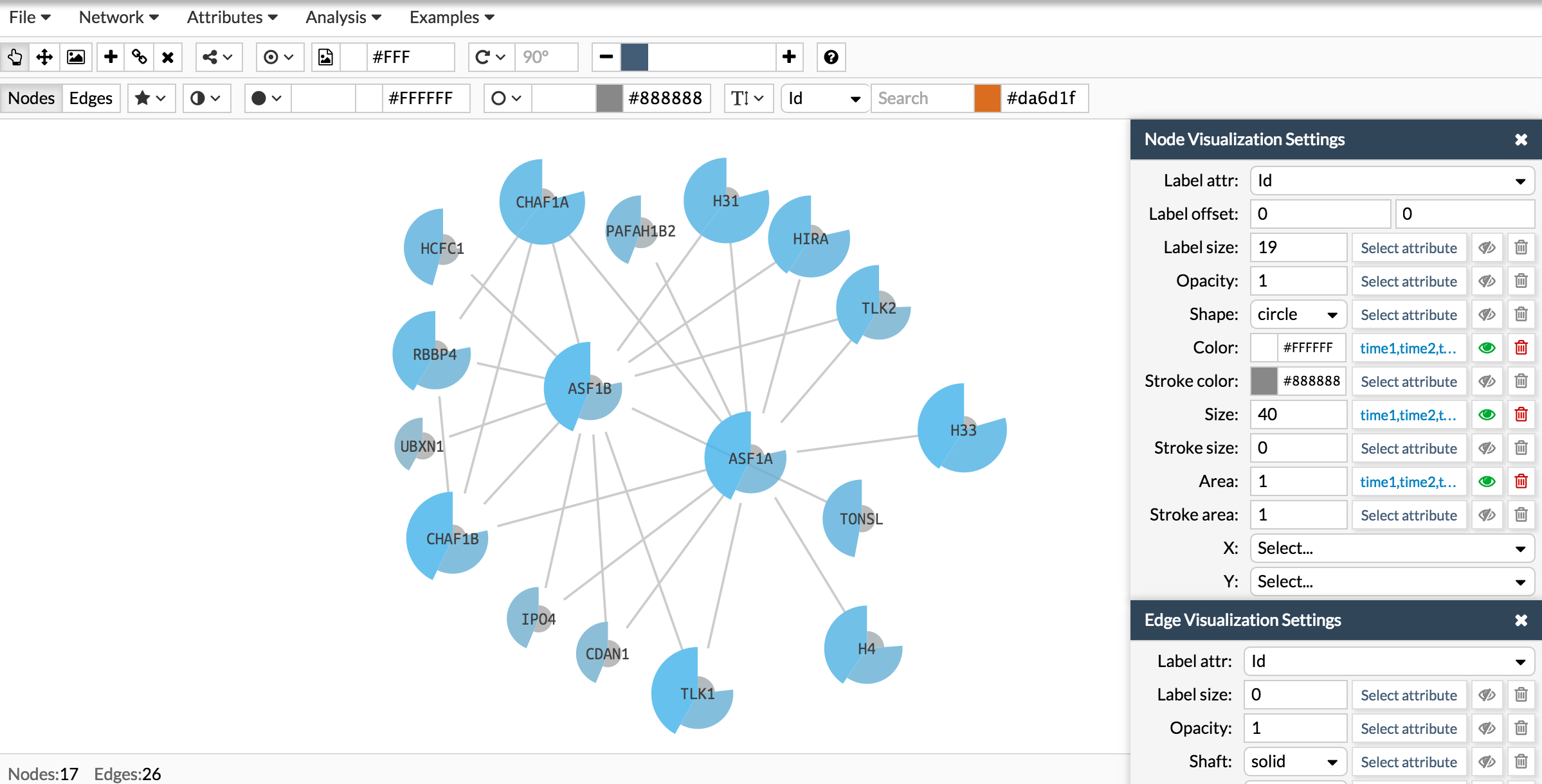
Now let's repeat the same process to add a donut like shape:
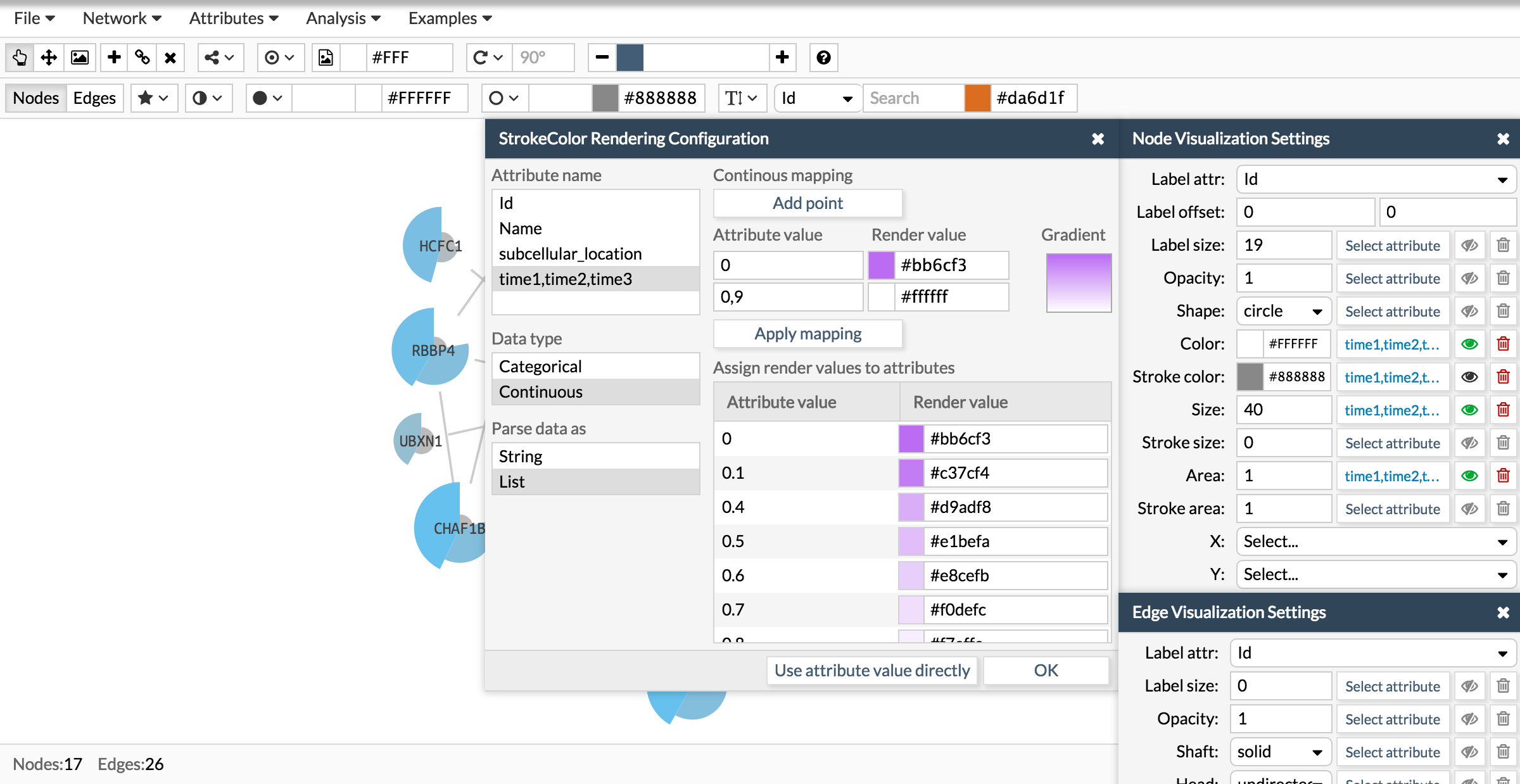
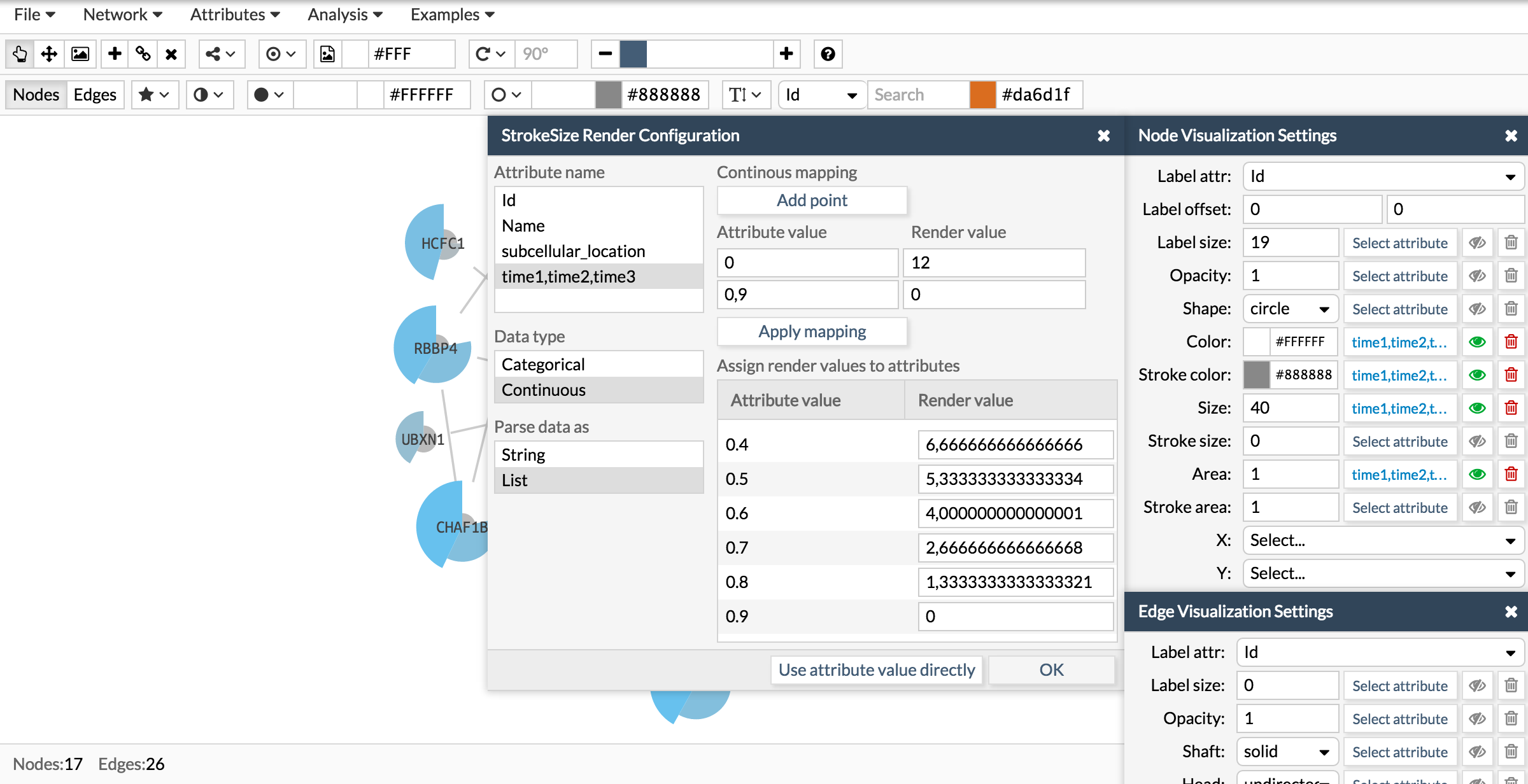
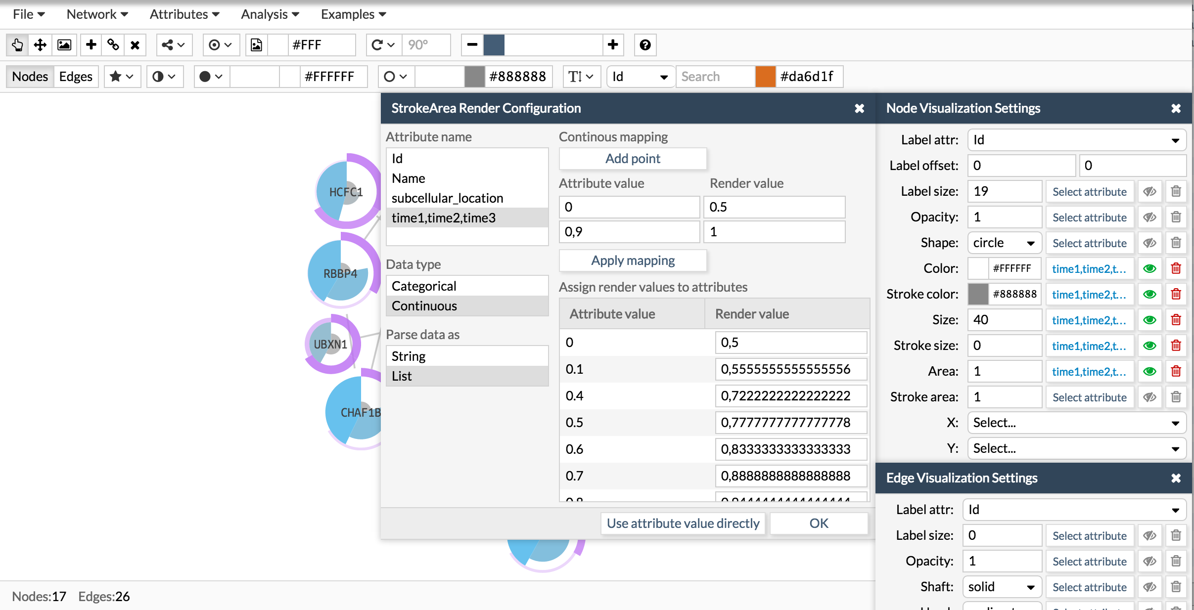
Here you have the final result:
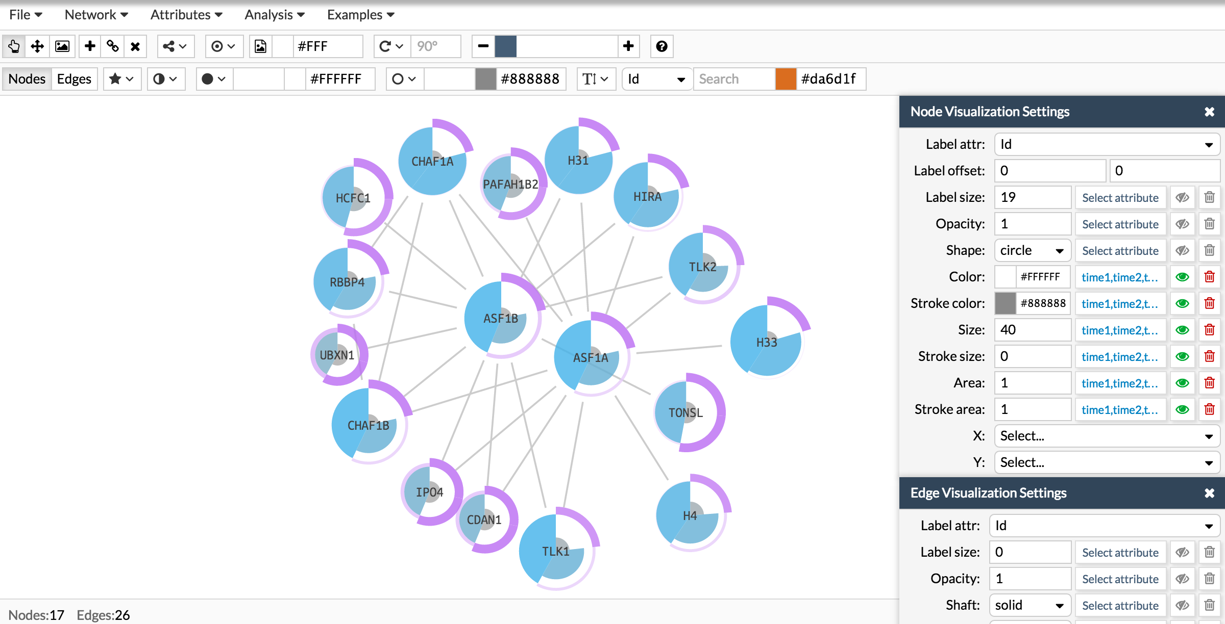
NOTE: Although here in the examples we have used always the same attribute to configure all the parameters, you can use different attributes as long as they have the same number of elements in the list. For example you can have one attribute for the gene expression measurements at the three conditions and another attribute where you measure the cell proliferation at the same three conditions. Here you would have two different attributes that will represent two different columns in the nodes data, but both attributes would be a list of three elements.
In the same way, you don't have to configure all the visual values, but you can choose the one that fits your necessities. Following the example above, you may want the pie colours to represent the gene expression and the stroke size representing the cell proliferation.