-
Notifications
You must be signed in to change notification settings - Fork 0
New issue
Have a question about this project? Sign up for a free GitHub account to open an issue and contact its maintainers and the community.
By clicking “Sign up for GitHub”, you agree to our terms of service and privacy statement. We’ll occasionally send you account related emails.
Already on GitHub? Sign in to your account
User Management #45
Open
Enigmatrix
wants to merge
10
commits into
main
Choose a base branch
from
feat/user_mgmt
base: main
Could not load branches
Branch not found: {{ refName }}
Loading
Could not load tags
Nothing to show
Loading
Are you sure you want to change the base?
Some commits from the old base branch may be removed from the timeline,
and old review comments may become outdated.
Open
User Management #45
Changes from all commits
Commits
Show all changes
10 commits
Select commit
Hold shift + click to select a range
a6f62a1
feat: initial add of user mgmt pages
Enigmatrix dda0719
feat: add per-page layout
Enigmatrix d88db45
feat: common centered bg layout
Enigmatrix 4570384
feat: login
Enigmatrix 0af298f
feat: reset password
Enigmatrix 629d768
feat: request reset password page
Enigmatrix 184a616
feat: remove create new user page (not covered in PR)
Enigmatrix 4db13a8
feat: rename forgot-password page
Enigmatrix f48f4f0
feat: settings page (account)
Enigmatrix 0e7fe00
feat: user list
Enigmatrix File filter
Filter by extension
Conversations
Failed to load comments.
Loading
Jump to
Jump to file
Failed to load files.
Loading
Diff view
Diff view
There are no files selected for viewing
This file contains bidirectional Unicode text that may be interpreted or compiled differently than what appears below. To review, open the file in an editor that reveals hidden Unicode characters.
Learn more about bidirectional Unicode characters
| Original file line number | Diff line number | Diff line change |
|---|---|---|
| @@ -0,0 +1,47 @@ | ||
| import Box from '@mui/material/Box' | ||
| import Layout from 'components/Layout' | ||
| import { ReactNode } from 'react' | ||
| import mr_logo from 'public/images/sidebar/mercy_relief_logo.png' | ||
| import { MR_GRAY_1 } from 'styles/theme' | ||
|
|
||
| type CenteredThemeBackgroundProps = { | ||
| children: ReactNode | ||
| } | ||
|
|
||
| // TODO get actual image | ||
| const BACKGROUND_IMAGE = 'red' | ||
|
|
||
| function CenteredThemeBackground({ children }: CenteredThemeBackgroundProps) { | ||
| return ( | ||
| <Layout enableSidebar={false}> | ||
| <Box sx={{ display: 'flex', flex: 1, background: BACKGROUND_IMAGE }}> | ||
| <Box | ||
| sx={{ | ||
| display: 'flex', | ||
| flex: 1, | ||
| flexDirection: 'column', | ||
| margin: 'auto', | ||
| maxWidth: 500, | ||
| paddingRight: { sm: 8, xs: 2 }, | ||
| paddingLeft: { sm: 8, xs: 2 }, | ||
| paddingTop: 20, | ||
| paddingBottom: 20, | ||
| borderRadius: { sm: 4, xs: 0 }, | ||
| background: MR_GRAY_1, | ||
| }} | ||
| > | ||
| <Box | ||
| component="img" | ||
| src={mr_logo.src} | ||
| alt="Mercy Relief Logo" | ||
| style={{ objectFit: 'fill', margin: 'auto', width: '50%' }} | ||
| /> | ||
| {children} | ||
| </Box> | ||
| </Box> | ||
| </Layout> | ||
| ) | ||
| } | ||
| 3 | ||
|
|
||
| export default CenteredThemeBackground |
This file contains bidirectional Unicode text that may be interpreted or compiled differently than what appears below. To review, open the file in an editor that reveals hidden Unicode characters.
Learn more about bidirectional Unicode characters
This file contains bidirectional Unicode text that may be interpreted or compiled differently than what appears below. To review, open the file in an editor that reveals hidden Unicode characters.
Learn more about bidirectional Unicode characters
| Original file line number | Diff line number | Diff line change |
|---|---|---|
| @@ -1,12 +1,22 @@ | ||
| import type { ReactElement, ReactNode } from 'react' | ||
| import type { NextPage } from 'next' | ||
| import type { AppProps } from 'next/app' | ||
| import Layout from 'components/Layout' | ||
|
|
||
| function MyApp({ Component, pageProps }: AppProps) { | ||
| return ( | ||
| <Layout> | ||
| <Component {...pageProps} /> | ||
| </Layout> | ||
| ) | ||
| // ref: https://nextjs.org/docs/basic-features/layouts | ||
| export type NextPageWithLayout<P = unknown, IP = P> = NextPage<P, IP> & { | ||
| getLayout?: (page: ReactElement) => ReactNode | ||
| } | ||
|
|
||
| type AppPropsWithLayout = AppProps & { | ||
| Component: NextPageWithLayout | ||
| } | ||
|
|
||
| function MyApp({ Component, pageProps }: AppPropsWithLayout) { | ||
| // Use the layout defined at the page level, if available | ||
| const getLayout = Component.getLayout ?? ((page) => <Layout>{page}</Layout>) | ||
|
|
||
| return getLayout(<Component {...pageProps} />) | ||
| } | ||
|
|
||
| export default MyApp |
This file contains bidirectional Unicode text that may be interpreted or compiled differently than what appears below. To review, open the file in an editor that reveals hidden Unicode characters.
Learn more about bidirectional Unicode characters
| Original file line number | Diff line number | Diff line change |
|---|---|---|
| @@ -0,0 +1,23 @@ | ||
| import type {NextPage} from "next"; | ||
| import Box from "@mui/material/Box"; | ||
| import Sidebar from "../components/Sidebar"; | ||
| import Typography from "@mui/material/Typography"; | ||
|
|
||
| // TODO: make these into properties pulled from the current user | ||
| const name = "John"; | ||
| const role = "Super Admin"; | ||
|
|
||
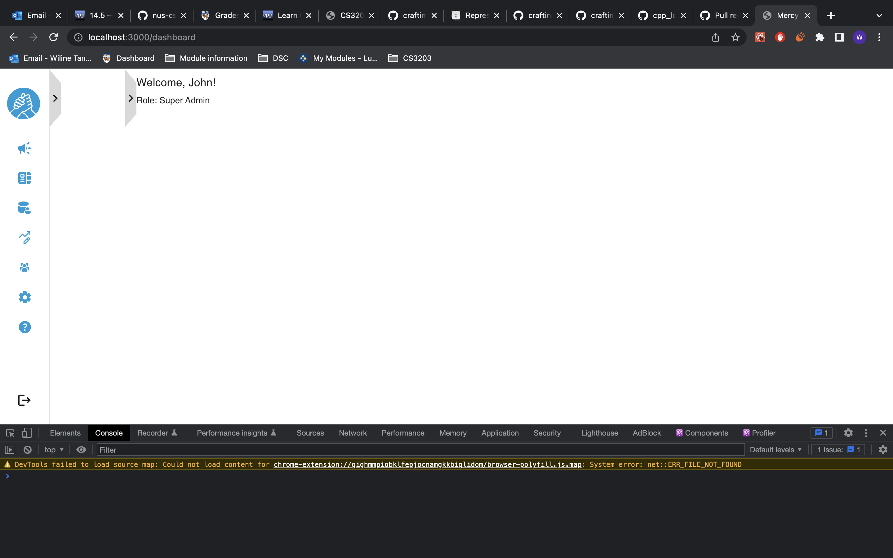
| const Dashboard: NextPage = () => { | ||
| return ( | ||
| /* TODO: This minHeight should be unnecessary when the layout is flex */ | ||
| <Box sx={{ minHeight: '100vh', display: 'flex' }}> | ||
| <Sidebar/> | ||
| <Box> | ||
| <Typography sx={{ marginTop: 2 }} variant="h6">{`Welcome, ${name}!`}</Typography> | ||
| <Typography sx={{ marginTop: 1 }} variant="subtitle2">{`Role: ${role}`}</Typography> | ||
| </Box> | ||
| </Box> | ||
| ) | ||
| } | ||
|
|
||
| export default Dashboard; | ||
This file contains bidirectional Unicode text that may be interpreted or compiled differently than what appears below. To review, open the file in an editor that reveals hidden Unicode characters.
Learn more about bidirectional Unicode characters
| Original file line number | Diff line number | Diff line change |
|---|---|---|
| @@ -0,0 +1,35 @@ | ||
| import Box from '@mui/material/Box' | ||
| import Typography from '@mui/material/Typography' | ||
| import Button from '@mui/material/Button' | ||
| import TextField from '@mui/material/TextField' | ||
| import type { NextPageWithLayout } from './_app' | ||
| import CenteredThemeBackground from 'components/CenteredThemeBackground' | ||
|
|
||
| const ForgotPassword: NextPageWithLayout = () => { | ||
| return ( | ||
| <Box sx={{ display: 'flex', flexDirection: 'column' }}> | ||
| <Typography | ||
| sx={{ marginTop: 3, marginBottom: 1, alignSelf: 'center' }} | ||
| variant="subtitle1" | ||
| fontWeight="bold" | ||
| > | ||
| Request for Password Reset | ||
| </Typography> | ||
| <TextField | ||
| sx={{ marginTop: 2 }} | ||
| id="email" | ||
| label="Email Address" | ||
| type="email" | ||
| /> | ||
| <Button sx={{ marginTop: 2 }} variant="contained"> | ||
| Send Reset Link | ||
| </Button> | ||
| </Box> | ||
| ) | ||
| } | ||
|
|
||
| ForgotPassword.getLayout = (page) => { | ||
| return <CenteredThemeBackground>{page}</CenteredThemeBackground> | ||
| } | ||
|
|
||
| export default ForgotPassword |
This file contains bidirectional Unicode text that may be interpreted or compiled differently than what appears below. To review, open the file in an editor that reveals hidden Unicode characters.
Learn more about bidirectional Unicode characters
| Original file line number | Diff line number | Diff line change |
|---|---|---|
| @@ -0,0 +1,40 @@ | ||
| import Box from '@mui/material/Box' | ||
| import Typography from '@mui/material/Typography' | ||
| import Button from '@mui/material/Button' | ||
| import TextField from '@mui/material/TextField' | ||
| import type { NextPageWithLayout } from './_app' | ||
| import CenteredThemeBackground from 'components/CenteredThemeBackground' | ||
| import Link from 'next/link' | ||
| import Alert from '@mui/material/Alert' | ||
|
|
||
| const Login: NextPageWithLayout = () => { | ||
| return ( | ||
| <Box sx={{ display: 'flex', flexDirection: 'column' }}> | ||
| <TextField sx={{ marginTop: 12 }} id="email" label="Email Address" /> | ||
| <TextField | ||
| sx={{ marginTop: 3, marginBottom: 2 }} | ||
| id="password" | ||
| label="Password" | ||
| type="password" | ||
| /> | ||
| <Link href="/ForgotPassword">Forget Password?</Link> | ||
| <Button sx={{ marginTop: 3 }} variant="contained"> | ||
| SIGN IN | ||
| </Button> | ||
| <Alert sx={{ marginTop: 3 }} severity="error"> | ||
| <Typography variant="subtitle2" fontWeight="bold"> | ||
| Login Failed! | ||
| </Typography> | ||
| <Typography variant="body2"> | ||
| Email address/password not found | ||
| </Typography> | ||
| </Alert> | ||
| </Box> | ||
| ) | ||
| } | ||
|
|
||
| Login.getLayout = (page) => { | ||
| return <CenteredThemeBackground>{page}</CenteredThemeBackground> | ||
| } | ||
|
|
||
| export default Login |
This file contains bidirectional Unicode text that may be interpreted or compiled differently than what appears below. To review, open the file in an editor that reveals hidden Unicode characters.
Learn more about bidirectional Unicode characters
| Original file line number | Diff line number | Diff line change |
|---|---|---|
| @@ -0,0 +1,41 @@ | ||
| import Box from '@mui/material/Box' | ||
| import Typography from '@mui/material/Typography' | ||
| import Button from '@mui/material/Button' | ||
| import TextField from '@mui/material/TextField' | ||
| import type { NextPageWithLayout } from './_app' | ||
| import CenteredThemeBackground from 'components/CenteredThemeBackground' | ||
|
|
||
| const ResetPassword: NextPageWithLayout = () => { | ||
| return ( | ||
| <Box sx={{ display: 'flex', flexDirection: 'column' }}> | ||
| <Typography | ||
| sx={{ marginTop: 3, marginBottom: 1 }} | ||
| variant="subtitle1" | ||
| fontWeight="bold" | ||
| > | ||
| Reset Password | ||
| </Typography> | ||
| <TextField | ||
| sx={{ marginTop: 2 }} | ||
| id="new-password" | ||
| label="New Password" | ||
| type="password" | ||
| /> | ||
| <TextField | ||
| sx={{ marginTop: 2 }} | ||
| id="confirm-new-password" | ||
| label="Confirm New Password" | ||
| type="password" | ||
| /> | ||
| <Button sx={{ marginTop: 2 }} variant="contained"> | ||
| Reset Password | ||
| </Button> | ||
| </Box> | ||
| ) | ||
| } | ||
|
|
||
| ResetPassword.getLayout = (page) => { | ||
| return <CenteredThemeBackground>{page}</CenteredThemeBackground> | ||
| } | ||
|
|
||
| export default ResetPassword |
This file contains bidirectional Unicode text that may be interpreted or compiled differently than what appears below. To review, open the file in an editor that reveals hidden Unicode characters.
Learn more about bidirectional Unicode characters
| Original file line number | Diff line number | Diff line change |
|---|---|---|
| @@ -0,0 +1,74 @@ | ||
| import type { NextPage } from 'next' | ||
| import Box from '@mui/material/Box' | ||
| import Tabs from '@mui/material/Tabs' | ||
| import Tab from '@mui/material/Tab' | ||
| import { ReactNode, useState } from 'react' | ||
| import Person from '@mui/icons-material/Person' | ||
| import TextField from '@mui/material/TextField' | ||
| import Button from '@mui/material/Button' | ||
| import Alert from '@mui/material/Alert' | ||
| import Lock from '@mui/icons-material/Lock' | ||
| import Container from '@mui/material/Container' | ||
|
|
||
| const Account = () => { | ||
| return ( | ||
| <Box sx={{ display: 'flex', flexDirection: 'column' }}> | ||
| {/* TODO Prefill based on Account information */} | ||
| <Box component="img" src="unlinked"></Box> | ||
| <TextField sx={{ marginTop: 2 }} label="Full Name" /> | ||
| <TextField sx={{ marginTop: 2 }} label="Email Address" /> | ||
| <Button sx={{ marginTop: 2, alignSelf: 'end' }} variant="contained"> | ||
| Save Changes | ||
| </Button> | ||
| </Box> | ||
| ) | ||
| } | ||
|
|
||
| const ChangePassword = () => { | ||
| return ( | ||
| <Box> | ||
| <Button sx={{ marginTop: 2 }} variant="contained"> | ||
| Request for password reset | ||
| </Button> | ||
| <Alert sx={{ marginTop: 2 }} severity="info"> | ||
| A reset link has been sent to your email! | ||
| </Alert> | ||
| </Box> | ||
| ) | ||
| } | ||
|
|
||
| interface IconTextProps { | ||
| icon: ReactNode | ||
| text: string | ||
| } | ||
|
|
||
| const IconText = ({ icon, text }: IconTextProps) => { | ||
| return ( | ||
| <Box sx={{ display: 'inline-flex', alignItems: 'center' }}> | ||
| {icon} | ||
| <Box sx={{ marginLeft: 1 }}>{text}</Box> | ||
| </Box> | ||
| ) | ||
| } | ||
|
|
||
| const Settings: NextPage = () => { | ||
| const [value, setValue] = useState(0) | ||
| return ( | ||
| <Container sx={{ display: 'flex', flexDirection: 'column', flex: 1 }}> | ||
| <Box sx={{ flex: 1, paddingTop: 20, margin: 'auto 0' }}> | ||
| <Tabs value={value} onChange={(_, v) => setValue(v)}> | ||
| <Tab label={<IconText icon={<Person />} text="Account" />} /> | ||
| <Tab label={<IconText icon={<Lock />} text="Change Password" />} /> | ||
| </Tabs> | ||
| <Box hidden={value !== 0}> | ||
| <Account /> | ||
| </Box> | ||
| <Box hidden={value !== 1}> | ||
| <ChangePassword /> | ||
| </Box> | ||
| </Box> | ||
| </Container> | ||
| ) | ||
| } | ||
|
|
||
| export default Settings |
Oops, something went wrong.
Add this suggestion to a batch that can be applied as a single commit.
This suggestion is invalid because no changes were made to the code.
Suggestions cannot be applied while the pull request is closed.
Suggestions cannot be applied while viewing a subset of changes.
Only one suggestion per line can be applied in a batch.
Add this suggestion to a batch that can be applied as a single commit.
Applying suggestions on deleted lines is not supported.
You must change the existing code in this line in order to create a valid suggestion.
Outdated suggestions cannot be applied.
This suggestion has been applied or marked resolved.
Suggestions cannot be applied from pending reviews.
Suggestions cannot be applied on multi-line comments.
Suggestions cannot be applied while the pull request is queued to merge.
Suggestion cannot be applied right now. Please check back later.
There was a problem hiding this comment.
Choose a reason for hiding this comment
The reason will be displayed to describe this comment to others. Learn more.
think for this page u don't need to add the sidebar? also what is this page suppose to be? if its the first landing page i think u can move this to index