v2.4.0
中文:
-
Design
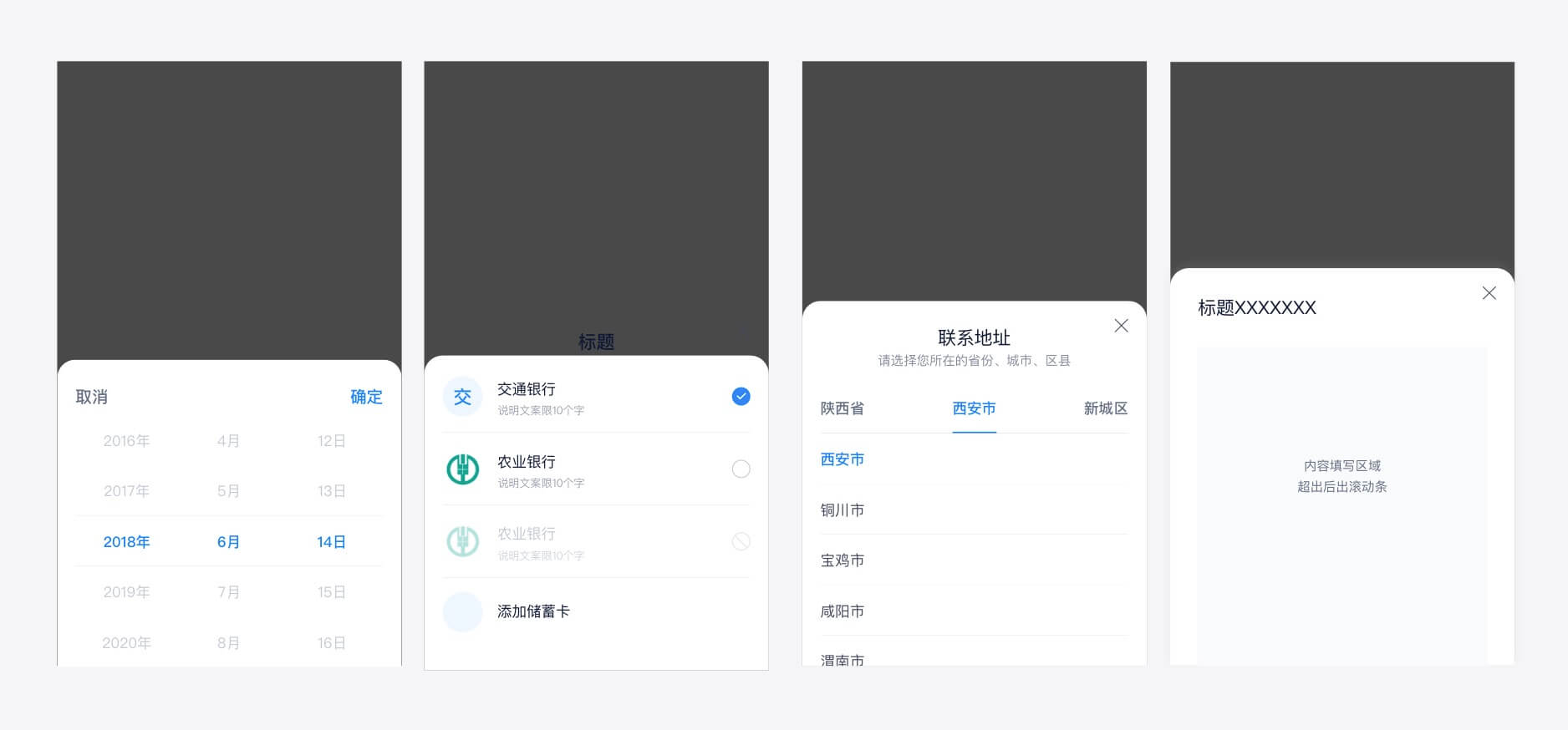
- 🍭金融设计规范更新,
Popup类组件标题栏border-radius由8px变为40px(大圆角模式),Dialog组件border-radius由8px变为12px
- 🍭金融设计规范更新,
-
Feature
-
PopupTitleBar增加以下属性:large-radius,用于支持大圆角模式only-close,用于快捷设置单个关闭按钮title-align,用于设置标题描述位置(left/right/center)
-
Picker,DatePicker,TabPicker,Selector,Cashier增加属性large-radius用于支持支持大圆角模式 -
Selector增加属性hide-title-bar,用于支持在无需确认模式下隐藏标题栏,增加插槽header,footer -
Button增加属性loading,用于设置加载状态 -
Dialog属性btns中增加两个状态设置disabled(禁用态)/loading(加载态),并在handler中回传btn实例#500export default { data () { return { btns: [{ text: '搜索', handler: this.btnHandler }] } }, methods: { btnHandler (btn) { this.$set(btn, 'loading', true) this.$set(btn, 'text', '搜索中') }, } }
-
-
Fix
English:
-
Design
- 🍭Financial design specification update, the title bar
border-radiusofPopupbased components changed from8pxto40px(Large-Radius pattern),border-radiusofDialogchanged from8pxto12px
- 🍭Financial design specification update, the title bar
-
Feature
-
PopupTitleBaradds following Props:large-radiusfor supporting Large-Radius patternonly-close, used to quickly set a single close buttontitle-align, used to set the position of title and description(left/right/center)
-
Picker,DatePicker,TabPicker,Selector,Cashieradd Proplarge-radiusfor supporting Large-Radius pattern -
Selectoradds Prophide-title-bar, used to support hiding the title bar in no confirmation mode, and adds slotsheader,footer -
Buttonadds Proploading, used to set the loading status -
DialogPropbtnsadds two status settingsdisabled/loading, and passing back thebtninstance inhandler#500export default { data () { return { btns: [{ text: 'Search', handler: this.btnHandler }] } }, methods: { btnHandler (btn) { this.$set(btn, 'loading', true) this.$set(btn, 'text', 'Searching') }, } }
-
-
Fix