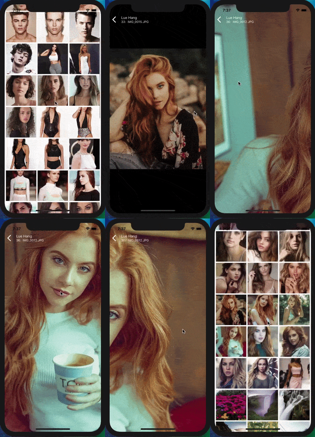
An easy and simple to use React Native component to render a custom layout for CameraRoll photos (next update will have videos) and displayed on a custom interactive image viewer for manipulation. Includes animations and support for both iOS and Android. Free and made possible along with costly maintenance and updates by Lue Hang (the author).
Check out the docs for a complete documentation.
- Choose a custom way to get images or use default CameraRoll getter.
- Optimized for large list rendering of images.
- Swipe up and down to close images.
- Pull to Refresh.
- Scroll loading.
- Support for dynamic device rotation.
- Easily and highly customizable.
- Includes guestures and important event listeners for pan, pinch, single tap and double tap.
- Includes zoom mode.
- Intelligent scrolling detection to cushion rough swipe guestures.
- Supports iOS and Android.
ℹ️ Learn more about React Native with project examples along with Cyber Security and Ethical Hacking at LueHsoft.
Built with react-native-gallery-swiper & react-native-smart-gallery.
4. API
5. 📚 Props
8. Author
9. Contribute
10. License
Type in the following to the command line to install the dependency.
$ npm install --save react-native-camera-roll-galleryor
$ yarn add react-native-camera-roll-gallery
Version *4.0.0 update
If you like
react-native-camera-roll-gallery, please be sure to give it a star at GitHub. Thanks.
import CameraRollGallery from "react-native-camera-roll-gallery";

//...
render() {
    return (
        <CameraRollGallery
            enableCameraRoll={false} // default true
            // Get data logic goes here.
            // This will get trigger initially
            // and when it reached the end
            // if there is more.
            onGetData={(fetchParams, resolve) => {
                resolve({
                    assets: [
                        // Can be used with different image object fieldnames.
                        // Ex. source, source.uri, uri, URI, url, URL
                        { uri: "https://luehangs.site/pic-chat-app-images/beautiful-blond-blonde-hair-478544.jpg" },
                        // { source: require("yourApp/image.png"),
                        //     // IMPORTANT: It is REQUIRED for LOCAL IMAGES
                        //     // to include a dimensions field with the
                        //     // actual width and height of the image or
                        //     // it will throw an error.
                        //     dimensions: { width: 1080, height: 1920 } },
                        { source: { uri: "https://luehangs.site/pic-chat-app-images/beautiful-beautiful-women-beauty-40901.jpg" } },
                        { uri: "https://luehangs.site/pic-chat-app-images/animals-avian-beach-760984.jpg" },
                        { URI: "https://luehangs.site/pic-chat-app-images/beautiful-blond-fishnet-stockings-48134.jpg" },
                        { url: "https://luehangs.site/pic-chat-app-images/beautiful-beautiful-woman-beauty-9763.jpg" },
                        { URL: "https://luehangs.site/pic-chat-app-images/attractive-balance-beautiful-186263.jpg" },
                    ],
                    pageInfo: {
                        hasNextPage: false
                    }
                });
            }}
        />
    );
}
//...ℹ️ Additional installation is required to install additional package and link binaries. Follow the Installation section.
If you like
react-native-camera-roll-gallery, please be sure to give it a star at GitHub. Thanks.
import CameraRollGallery from "react-native-camera-roll-gallery";

//...
render() {
    return (
        <CameraRollGallery />
    );
}
//...
<CameraRollGallery /> component accepts the following props...
If you like
react-native-image-layout, please be sure to give it a star at GitHub. Thanks.
| Props | Description | Type | Default |
|---|---|---|---|
enableCameraRoll |
Enable the provide default CameraRoll. Version *3.0.0 update | boolean |
true |
onGetData |
Custom function to render provided images from initial to when reaching the end. "Get" data logic should go here. (fetchParams: { previousCount: number, itemCount: number, groupTypes: string, assetType: string }, resolve: Function) => { assets: object, pageInfo: { hasNextPage: boolean } } Find an example at the example section. Version *4.0.0 update |
Function |
|
imagesPerRow |
Number of images per row. | number |
3 |
imageMargin |
Margin size of one image. | number |
5 |
containerWidth |
Width of Camera Roll layout container. | number |
device width |
initialNumToRender |
Specifies how many items we want to render on our first render pass for the Camera Roll layout. | number |
6 |
itemCount |
The number of item to fetch and render. Version *3.0.0 update | number |
100 |
groupTypes |
The group where the photos will be fetched, one of "Album", "All", "Event", "Faces", "Library", "PhotoStream" and "SavedPhotos". | string |
"All" |
assetType |
The asset type, one of "Photos", "Videos" or "All". | string |
"Photos" |
removeClippedSubViews |
"When true, offscreen child views (whose overflow value is hidden) are removed from their native backing superview when offscreen. This can improve scrolling performance on long lists. The default value is true. | boolean |
true |
backgroundColor |
Set background color of Camera Roll layout. | string |
"white" |
emptyText |
Text to display instead of a list when there are no photos found. | string |
"No photos." |
emptyTextStyle |
Styles to apply to the emptyText. |
object |
{textAlign: "center"} |
loader |
Camera Roll loader component node. | React.Component |
<ActivityIndicator /> |
loaderColor |
The foreground color of the initial load spinner. | string |
"lightblue" |
cameraRollFlatListProps |
Props to be passed to the underlying FlatList Camera Roll layout. See FlatList props... |
object |
|
cameraRollListHeader |
Custom function to render the Camera Roll list header. () => React.Element |
Function |
|
cameraRollListFooter |
Custom function to render the Camera Roll list footer. () => React.Element |
Function |
|
imageContainerStyle |
The styles object which is added to the Image component. | object |
{} |
renderIndividualHeader |
Custom function that is executed ABOVE each individual image. (item: object, index: number, onClose: Function) => ?React.Element |
Function |
|
renderIndividualFooter |
Custom function that is executed BELOW each individual image. (item: object, index: number, onClose: Function) => ?React.Element |
Function |
|
onEndReached |
Called once when the scroll position gets within onEndReachedThreshold of the rendered content. () => void Version *4.1.0 update |
function |
|
onEndReachedThreshold |
How far from the end (in units of visible length of the list) the bottom edge of the list must be from the end of the content to trigger the onEndReached callback. Thus a value of 0.5 will trigger onEndReached when the end of the content is within half the visible length of the list. Version *4.1.0 update |
number |
0.8 |
keyExtractor |
Used to extract a unique key for a given item at the specified index. Key is used for caching and as the react key to track item re-ordering. The default extractor checks item.key, then falls back to using the index, like React does. Version *4.2.0 update |
Function |
Inorder to use these props, make sure enableCameraRoll prop is set to true.
| Props | Description | Type | Default |
|---|---|---|---|
catchGetPhotosError |
Custom function to catch errors from getting and loading images. (error) => void Version *3.0.0 update |
Function |
|
permissionDialogTitle |
Starting on android M individual permissions must be granted for certain services, having access to the camera roll is one of them, you can use this to change the title of the dialog prompt requesting permissions. | string |
"Read Storage Permission" |
permissionDialogMessage |
Starting on android M individual permissions must be granted for certain services, having access to the camera roll is one of them, you can use this to change the content of the dialog prompt requesting permissions. | string |
"Needs access to your photos so you can use these awesome services." |
pendingAuthorizedView |
Starting on android M individual permissions must be granted for certain services, having access to the camera roll is one of them. This will be displayed when access to the camera roll has been denied. | React.Element |
Defaults to Waiting on access permission to camera roll. message. |
notAuthorizedView |
Starting on android M individual permissions must be granted for certain services, having access to the camera roll is one of them. This will be displayed when access to the camera roll has been denied completely. | React.Element |
Defaults to Access denied to camera roll. message. |

If you like
react-native-image-layout, please be sure to give it a star at GitHub. Thanks.
| Props | Description | Type | Default |
|---|---|---|---|
imagePageComponent |
Custom function to render the images for gallery. First param is the image props and second param is the dimensions. (imageProps: { imageLoaded: boolean, source: object, image: object, style: Array<object>, resizeMode: string, capInsets: object, onLoadStart: Function, onLoad: Function, ...extras }, imageDimensions: {width: number, height: number}, index: number) => React.Element index params included in Version *1.3.0 update |
Function |
<Image/> component |
errorPageComponent |
Custom function to render the page of an image in gallery that couldn't be displayed. | Function |
<View/> with stylized error |
renderPageHeader |
Custom function to render gallery page header and must return a React Component. (item: object, index: number, onClose: Function) => ?React.Element The onClose function is use to close gallery pages and return to the camera roll layout. |
Function |
|
renderPageFooter |
Custom function to render gallery page footer and must return a React Component. (item: object, index: number, onClose: Function) => ?React.Element The onClose function is use to close gallery pages and return to the camera roll layout. |
Function |
|
pagesFlatListProps |
Props to be passed to the underlying FlatList gallery. See FlatList props... |
object |
{windowSize: 3} |
pageMargin |
Blank space to show between images in gallery. | number |
0 |
sensitivePageScroll |
Whether to enable an intelligent detection to detect rough and fast swiping gestures in order to "cushion" or slow down a swipe at the end. Version *1.2.0 update. | boolean |
false |
onPageSelected |
Fired with the index of page that has been selected in gallery. (index: number) => void |
Function |
Function |
onPageScrollStateChanged |
Called when page scrolling state has changed in gallery. See scroll state and events... (state: string) => void |
Function |
|
onPageScroll |
Scroll event for page gallery. See scroll state and events... (event: { position: number, offset: number, fraction: number }) => void |
Function |
|
pageScrollViewStyle |
Custom style for the FlatList component for gallery. |
object |
{} |
onPageSingleTapConfirmed |
Fired after a single tap on page in gallery. () => void |
Function |
|
onPageLongPress |
Fired after a long press on page in gallery. () => void |
Function |
|
onDoubleTapConfirmed |
Executed after a double tap. (index: number) => void Version *2.1.0 update. |
Function |
|
onDoubleTapStartReached |
Executed after scaling out or zooming out using double tap. (transform: { scale: number, translateX: number, translateY: number }, index: number) => void Version *2.1.0 update. |
Function |
|
onDoubleTapEndReached |
Executed after scaling in or zooming in using double tap. (transform: { scale: number, translateX: number, translateY: number }, index: number) => void Version *2.1.0 update. |
Function |
|
onPinchTransforming |
Executed while pinching to transform view or zoom (view transformer). (transform: { scale: number, translateX: number, translateY: number }, index: number) => void Version *2.1.0 update. |
Function |
|
onPinchStartReached |
Executed after scaling out or zooming out to initial size using the pinch gesture. (transform: { scale: number, translateX: number, translateY: number }, index: number) => void Version *2.1.0 update. |
Function |
|
enableScale |
Enable or disable zoom and double tap zoom (view transformer). Version *2.1.0 update. | boolean |
true |
maxScale |
Max zoom (view transformer). Version *2.1.0 update. | number |
Math.max(imageWidth / viewWidth, imageHeight / viewHeight) |
enableTranslate |
Enable or disable moving while in zoom (view transformer). Version *2.1.0 update. | boolean |
true |
resizeMode |
The mechanism that should be used to resize the image when the image's dimensions differ from the image view's dimensions. Expecting one of "contain", "cover", "stretch", "repeat", "center". Version *2.1.0 update. |
string |
"contain" |
enableResistance |
Enable or disable resistance over panning (view transformer). Version *2.1.0 update. | boolean |
true |
resistantStrHorizontal |
Resistant value for left and right panning (view transformer). (dx: number) => number Version *2.1.0 update. |
Function, number or string |
(dx) => (dx /= 3) |
resistantStrVertical |
Resistant value for top and bottom panning (view transformer). (dy: number) => number Version *2.1.0 update. |
Function, number or string |
(dy) => (dy /= 3) |
onViewTransformed |
Executed while being transformed in anyway (view transformer). (transform: { scale: number, translateX: number, translateY: number }, index: number) => void Version *2.1.0 update. |
Function |
|
onTransformGestureReleased |
Executed after a transform guesture released (view transformer). (transform: { scale: number, translateX: number, translateY: number }, index: number) => void Version *2.1.0 update. |
Function |
|
onSwipeUpReleased |
Executed after releasing an upward swipe at a specific y translate while not in zoom mode. (transform: { scale: number, translateX: number, translateY: number }, index: number) => void For custom precision swiping gestures, refer to the onTransformGestureReleased. Version *4.2.0 update. |
Function |
|
onSwipeDownReleased |
Executed after releasing a downward swipe at a specific y translate while not in zoom mode. (transform: { scale: number, translateX: number, translateY: number }, index: number) => void For custom precision swiping gestures, refer to the onTransformGestureReleased. Version *4.2.0 update. |
Function |
|
maxOverScrollDistance |
A number used to determine final scroll position triggered by fling (view transformer). Version *2.1.0 update. | number |
20 |
enableVerticalExit |
Enable or disable exiting from swiping up or down in gallery. Version *2.2.0 update. | boolean |
true |
enableModal |
Enable or disable modal for gallery. This also helps with Androids back button. Version *4.3.0 update. | boolean |
false |

Android Installation
$ npm install @react-native-community/cameraroll --saveor
$ yarn add @react-native-community/camerarollAutolinking will just do the job.
User's permission is required to access the Camera Roll. Add the following to AndroidManifest.xml which can be found in android/app/src/main.
<uses-permission android:name="android.permission.READ_EXTERNAL_STORAGE" />iOS Installation
$ npm install @react-native-community/cameraroll --saveor
$ yarn add @react-native-community/camerarollAutolinking will just do the job.
User's permission is required to access the Camera Roll. Add the NSPhotoLibraryUsageDescription key in your Info.plist with a string that describes how your app will use this data. This key will appear as Privacy - Photo Library Usage Description in Xcode.
<dict>
    <!-- ... -->
    <key>NSPhotoLibraryUsageDescription</key>
    <string>Requesting access to the photo library.</string>
    <!-- ... -->
</dict>It is required to add the NSPhotoLibraryAddUsageDescription key in your Info.plist. After that, define a string that describes how your app will use this data. By adding this key to your Info.plist, you will be able to request write-only access permission from the user. If you try to save to the camera roll without this permission, your app will exit.
<dict>
    <!-- ... -->
    <key>NSPhotoLibraryAddUsageDescription</key>
    <string>Requesting write-only access permission.</string>
    <!-- ... -->
</dict>Android Installation
User's permission is required to access the Camera Roll. Add the following to AndroidManifest.xml which can be found in android/app/src/main.
<uses-permission android:name="android.permission.READ_EXTERNAL_STORAGE" />iOS Installation
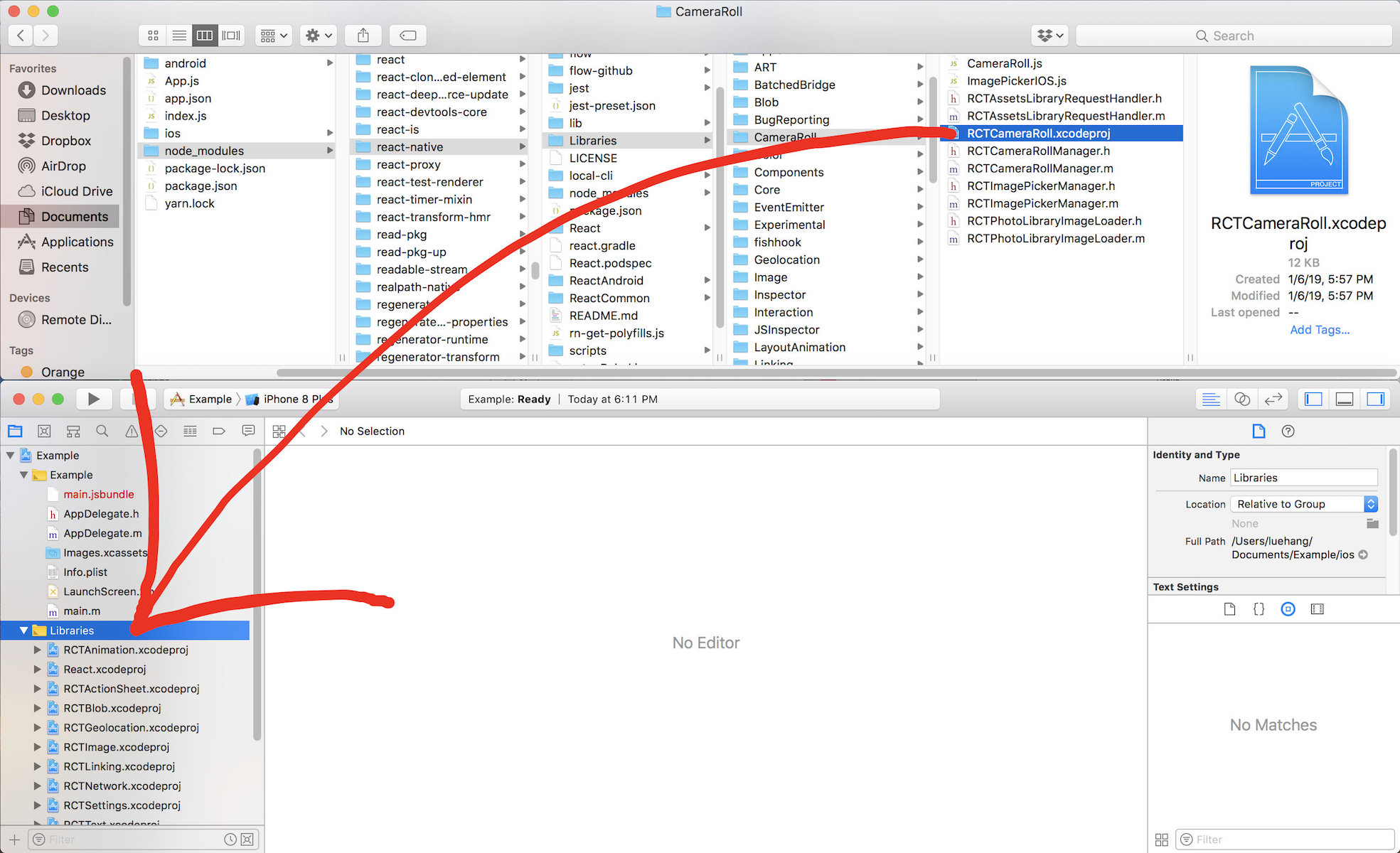
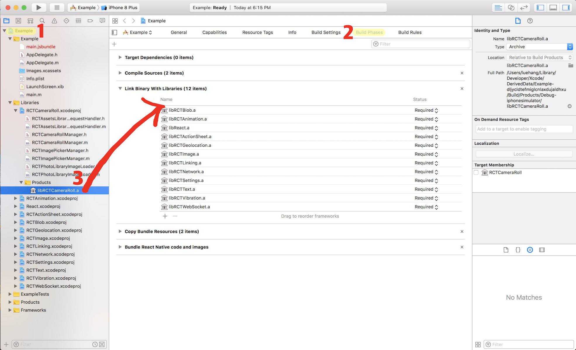
react-native-camera-roll-galleryuses React Native'sCameraRollAPI. It requires theRCTCameraRolllibrary to be linked. Learn more about Linking Libraries (iOS) clicking here or read for further instructions.
- Access the
node_modules/react-native/Libraries/CameraRolldirectory and look forRCTCameraRoll.xcodeproj. Drag this file to your project on Xcode (usually under theLibrariesgroup on Xcode).
- Click on your main
.xcodeprojproject file and select theBuild Phasestab and drag the static library from theProductsfolder inside the library you are importing toLink Binary With Libraries.
User's permission is required to access the Camera Roll. Add the NSPhotoLibraryUsageDescription key in your Info.plist with a string that describes how your app will use this data. This key will appear as Privacy - Photo Library Usage Description in Xcode.
<dict>
    <!-- ... -->
    <key>NSPhotoLibraryUsageDescription</key>
    <string>Requesting access to the photo library.</string>
    <!-- ... -->
</dict>It is required to add the NSPhotoLibraryAddUsageDescription key in your Info.plist. After that, define a string that describes how your app will use this data. By adding this key to your Info.plist, you will be able to request write-only access permission from the user. If you try to save to the camera roll without this permission, your app will exit.
<dict>
    <!-- ... -->
    <key>NSPhotoLibraryAddUsageDescription</key>
    <string>Requesting write-only access permission.</string>
    <!-- ... -->
</dict>
Perform steps 1-2 to run locally:
1. Clone the Repo
Clone react-native-camera-roll-gallery locally. In a terminal, run:
$ git clone https://github.com/Luehang/react-native-camera-roll-gallery.git react-native-camera-roll-gallery2. Install and Run
$ cd react-native-camera-roll-gallery/example/1. check out the code
2. npm install
3. npm run ios
1. check out the code
2. npm install
3. emulator running in separate terminal
4. npm run android


Free and made possible along with costly maintenance and updates by Lue Hang (the author).
Pull requests are welcomed.
Contributors will be posted here.
Not sure where to start, or a beginner? Take a look at the issues page.
MIT © Lue Hang, as found in the LICENSE file.


