| title | author | output | editor_options | ||||||||||
|---|---|---|---|---|---|---|---|---|---|---|---|---|---|
RNA-seq for Beginners |
Sheffield Bioinformatics Core |
|
|
![]()
web : sbc.shef.ac.uk
twitter: @SheffBioinfCore
email: [email protected]
- Appreciate some of the issues that can arise when designing an RNA-seq experiment
- Interpret an Multi-dimensional scaling (MDS) plot to check for batch effects and confounding factors
- Use Degust to generate a statistically robust gene list
- Perform a gene set enrichment analysis using available online tools
- Basic principles of Experimental design for RNA-seq experiments
- The steps in a best-practice pipeline for RNA-seq analysis
- Configuring the Degust interface to perform different types of differential expression
- The theory behind popular methods for pathways and gene set enrichment analysis
We will only be discussing BULK RNA-seq rather than single-cell. Whilst most of techniques introduced are relevant to single-cell data, single-cell has it's own analysis issues that will be covered elsewhere.
An overall workflow for the processing and analysis of RNA-seq data is given in the image below from Ting-You Wang's RNA-seq analysis page.
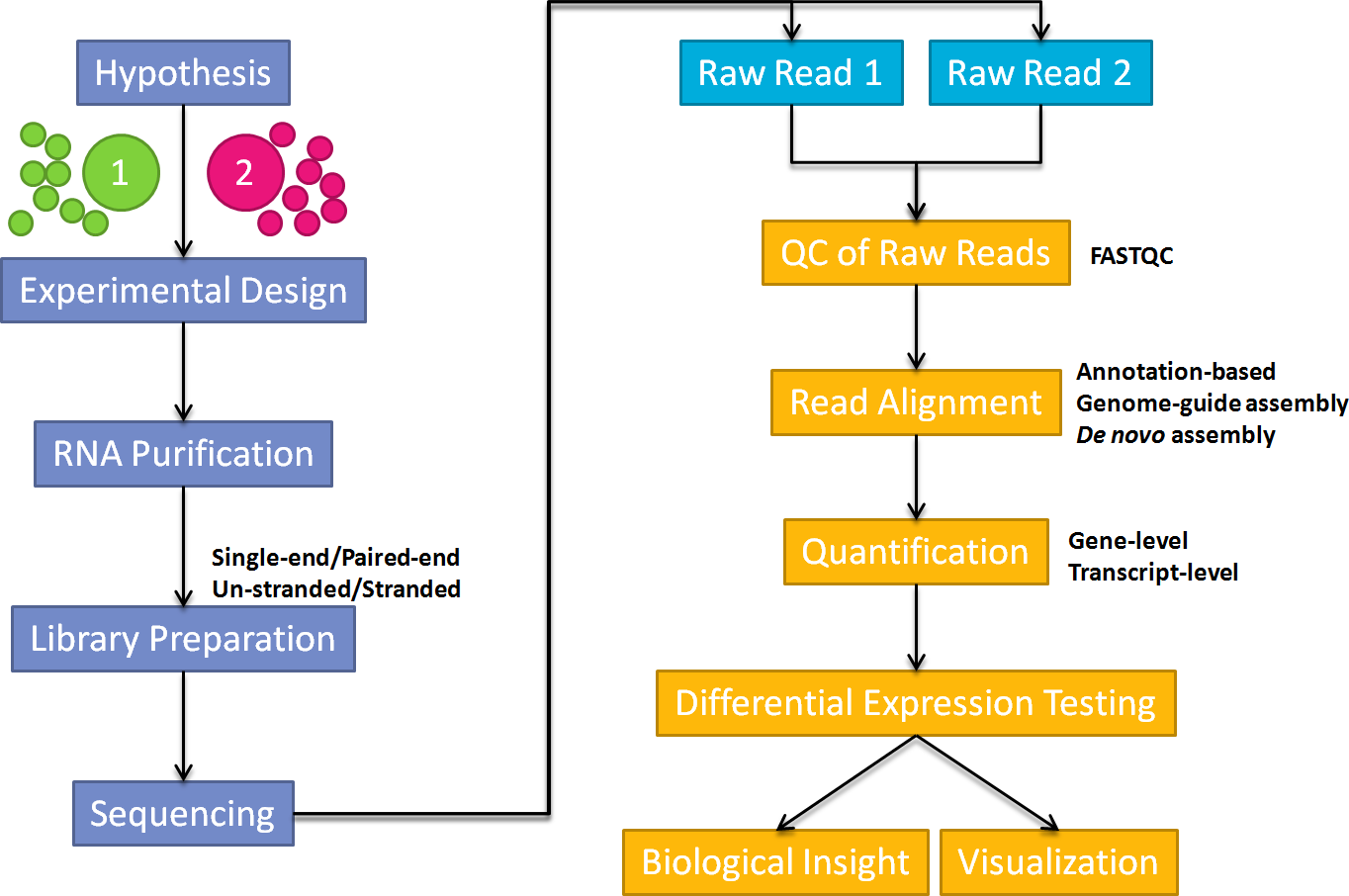
In this workshop we are going to concentrate on differential-expression and pathways analysis - which are the least computationally-intensive parts of the workflow and require the least Bioinformatics experience.
For those interested in alignment and QC steps, we have some materials available that use the Galaxy online resource
We will also have some courses on using the command-line and the nextflow workflow manager to process raw RNA-seq data.
For those that may prefer to perform analysis in R, which gives greater control over the analysis and support for reproducible analysis, we also have an more in-depth course. See our training page for details of when this course will run next
However, regardless of whatever method you use to process the data, decisions that you make before commencing sequencing can have a huge impact on the results.
A short introduction to Next Generation Sequencing can be found in this youtube video
A good overview of RNA-seq analysis can be found here
We will now briefly describe the processes involving in turning raw sequencing data into the data that we will be using in this workshop.
Raw raw-seq data are delivered in the form of fastq files. These are large (typically several Gb) that contain information on the sequences that have been generated for each biological sample; one fastq (or pair of fastqs) for each sample. Each set of four lines describe one sequence (called a "read").
A typical RNA-seq experiment will have 10 - 30 million reads in a fastq file, with each read about 100 bases long
@D0UW5ACXX120511:8:1204:6261:40047/1
AATGTTTATGTTCTTAAATTTTAGTTGTATATGTGAATCTTTGTAGTTTTTGCTAAAATACTAAGTAATTTATATAAAAGTGAGTTAAGAGATTTTTCTGA
+
CCCFFFFFHHHHHJJJJJIJJJJJIJJHIIJIJIJJIJJJIJJHIIHIJJJJJJBEGIHIJICGIDICFGIJJJIIJJGJ>F>GAGCGEEHEHHEEFFFD>
Quality assessment can be performed to see if the raw sequences are of sufficient quality for analysis

As the fastq files are large, we tend to analyse them using command-line software and a computing cluster
The traditional workflow for RNA-seq compares the sequences to a reference genome to see which genomic region each read matches the best.
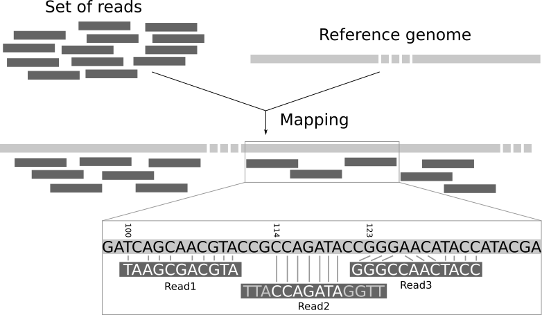
Again, this requires more memory than a typical laptop or desktop machine so is performed on a remote computer with large memory. The resulting file is called a bam and records the best genomic match for each read. However, as we are interested in gene expression we want to relate these mappings to the positions of genes.
A variety of different counting methods can determine how many reads overlap each known gene region. These are know as the raw counts and are the kind of data we will start with today.

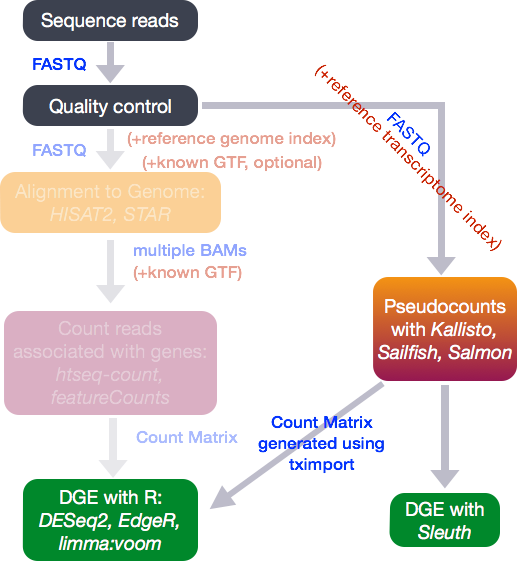
Recent tools for RNA-seq analysis (e.g. salmon, kallisto) do not require the time-consuming step of whole-genome alignment to be performed, and can therefore produce gene-level counts in a much faster time frame. They not require the creation of large bam files, which is useful if constrained by file space on Galaxy.
(image from Harvard Bioinformatics Core)
Before embarking on any high-throughput experiment, it is important to pay due attention to the experimental design. This famous quote from the statistician R.A Fisher in the 1938 is still applicable to modern technologies
To call in the statistician after the experiment is done may be no more than asking him to perform a postmortem examination: he may be able to say what the experiment died of.
Experimental Design encompasses questions such as
- which controls to use?
- positive / negative controls
- healthy controls
- what experimental conditions?
- what technical and biological factors are present?
When performing a high-throughput experiment, our measurements will be subject to biological variation (which we may be interested in) and technical variation (which we probably won't be). Being able to control these factors and minimise biases is key to experimental design.
Confounding factors in our design may arise by accident, or might be caused by not considering all possible sources of variation:-
 (image from Cancer Research UK Cambridge Institute course on Experimental Design)
We can also introduce so-called "batch-effects" by our choice of when samples are prepared for sequencing. Large experiments may necessitate multiple runs or batches, and we should try and minimize the possible impact of batches but including a good representation of each condition of interest in each batch.
 (image from Cancer Research UK Cambridge Institute course on Experimental Design)
When planning next-generation sequencing experiments, you will also need to consider
- the type of sequencing (e.g. whole-genome, exome, RNA-seq)
- will largely be dictated by your biological question
- single-end or paired-end
- how many reads (10 Million? 20 Million?, 100 Million?)
Some recommendations on these questions and more are provided by the Cancer Research Uk Cambridge Institute Genomics Core. Often the sequencing vendor performing your experiment will have some default options available.
The vendor may not advise on the sample-size; how many samples you will be sequencing to address your biological hypothesis of interest. This is a complex question and is often influenced by practical and financial constraints. For researchers based in Sheffield, The Sheffield Bioinformatics Core is able to advise on this, and any of the other issues above. [email protected]
A differential expression analysis requires two input files to be created.
- a count matrix
- a sample sheet or meta data table
The count matrix can be obtained by performing quantification (outside the scope of this workshop...). This will usually be generated for you by the sequencing vendor or Bioinformatics Core. The structure of the count matrix is shown below.
| gene | sampleA | sampleB |
|---|---|---|
| A | 1500 | 900 |
| B | 20 | 10 |
| ... | ... | ... |
The gene named A was sequenced 1500 times on sampleA and 900 times on sampleB etc. These are referred to as raw counts. However, we cannot just put this numbers into a standard statistical test (e.g. t-test) to assess significance. There are several reasons for this.
- The count values do not follow a normal-distribution so cannot be analysed using traditional methods
- There are many, many genes being measured in the dataset leading to a multiple testing problem.
- The count values are influenced by technical (as opposed to biological) variation that need to be accounted for:-
- size of gene; longer genes will have more reads assigned to them
- library size; for a sample that is sequenced to a higher depth it will seem as though all genes are more highly-expressed.
The sample sheet or meta data is used to associate each column in the count matrix to
| Name | Condition | Gender | Batch |
|---|---|---|---|
| sampleA | Healthy | M | 1 |
| sampleB | Disease | F | 1 |
| sampleC | Disease | M | 2 |
The term differential expression was first used to refer to the process of finding statistically significant genes from a microarray gene expression study.
In this figure we show the expression level measured for a gene in a number of different samples. Each sample belongs to biological condition A or B. We are interested in whether the expression level of the gene is different in condition A or B (which could represent healthy or disease individuals, for example).

Such methods were developed on the premise that microarray expression values are approximately normally-distributed when appropriately transformed (e.g. by using a log$_2$ transformation) so that a modified version of the standard t-test can be used. The same test is applied to each gene under investigation yielding a test statistic, fold-change and p-value. Similar methods have been adapted to RNA-seq data to account for the fact that the data are count-based and do not follow a normal distribution.

Degust is a web tool that can analyse counts files and test for differential gene expression. It offers and interactive view of the differential expression results and also sample quality assessment.
R-based methods such as edgeR (implemented in Degust) and DESeq2 have their own method of normalising counts. You will probably encounter other methods of normalising RNA-seq reads such as RPKM, CPM, TPM etc. This blog provides a nice explanation of the current thinking. As part of the Degust output, you have the option of downloading normalised counts in various formats. Some other online visualisation tools require normalised counts as input, so it is good to have these to-hand.
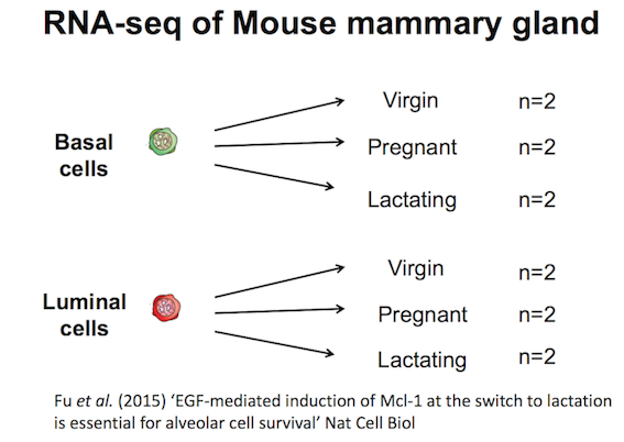
We will use a previously-published count matrix. This was downloaded from the Gene Expression Omnibus (GEO) under the accession number GSE60450. Note that we have shortened the column headings and added gene symbols to help with visualisation and annotation
The experimental design is as follows:-
::: exercise Download the counts from this link :::
- From the main degust page, click Upload your counts file
- Click on Browse
- Select the location of the file
GSE60450_Lactation-GenewiseCounts_rename_symbol.csv, and click Open. - Click Upload
- A Configuration page will appear.

- For Name type "GSE60450" (or whatever you want to call the analysis)
- For Info columns select SYMBOL
- Click Add condition
- Referring to the experiment design (below), select the Basal samples and call the condition Basal
- Repeat for the Luminal samples
- Save the settings and then View the results
| Run | Name | CellType | Status |
|---|---|---|---|
| SRR1552444 | MCL1-LA | basal | virgin |
| SRR1552445 | MCL1-LB | luminal | virgin |
| SRR1552446 | MCL1-LC | Luminal | pregnancy |
| SRR1552447 | MCL1-LD | Luminal | pregnancy |
| SRR1552448 | MCL1-LE | luminal | lactation |
| SRR1552449 | MCL1-LF | luminal | lactation |
| SRR1552450 | MCL1-DG | basal | virgin |
| SRR1552451 | MCL1-DH | luminal | virgin |
| SRR1552452 | MCL1-DI | basal | pregnancy |
| SRR1552453 | MCL1-DJ | basal | pregnancy |
| SRR1552454 | MCL1-DK | basal | lactation |
| SRR1552455 | MCL1-DL | basal | lactation |
- Top black panel with Configure settings at right.
- Left: Conditions: Control and Treatment.
- Left: Method selection for DGE.
- Top centre: Plots, with options at right.
- When either of the expression plots are selected, a heatmap appears below.
- A table of genes (or features); expression in treatment relative to control (Treatment column); and significance (FDR column).
(Not that the screenshots are for illustration purposes and taken from a different dataset to that being analysed in the tutorial)
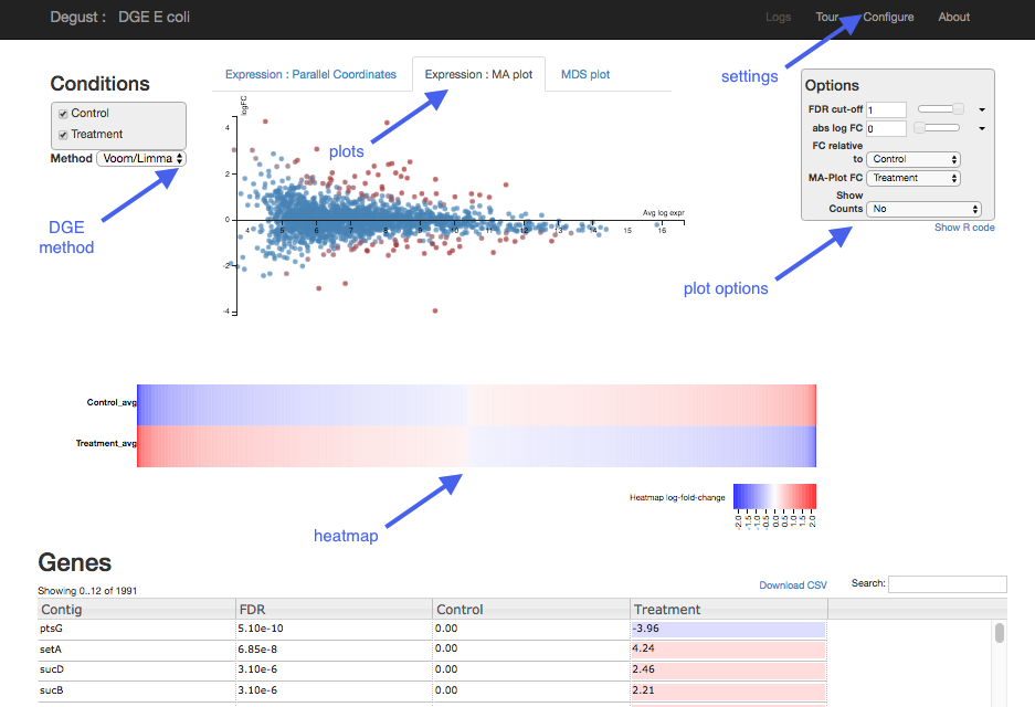

Each dot shows the change in expression in one gene.
- The average expression (over both condition and treatment samples) is represented on the x-axis.
- Plot points should be symmetrical around the x-axis.
- We can see that many genes are expressed at a low level, and some are highly expressed.
- The fold change is represented on the y axis.
- If expression is significantly different between batch and chem, the dots are red. If not, they are blue. (In Degust, significant means FDR <0.05).
- At low levels of gene expression (low values of the x axis), fold changes are less likely to be significant.
Click on the dot to see the gene name.

Each line shows the change in expression in one gene, between control and treatment.
- Go to Options at the right.
- For FDR cut-off set at 0.001.
- This is a significance level (an adjusted p value). We will set it quite low in this example, to ensure we only examine key differences.
- Look at the Parallel Coordinates plot. There are two axes:
- Left: Control: Gene expression in the control samples. All values are set at zero.
- Right: Treatment Gene expression in the treatment samples, relative to expression in the control.
- The blocks of blue and red underneath the plot are called a heatmap.
- Each block is a gene. Click on a block to see its line in the plot above.
- Look at the row for the chem. Relative to batch, genes expressed more are red; genes expressed less are blue.

Table of genes
- gene_id: names of genes. Note that gene names are sometimes specific to a species, or they may be only named as a locus ID (a chromosomal location specified in the genome annotation).
- FDR: False Discovery Rate. This is an adjusted p value to show the significance of the difference in gene expression between two conditions. Click on column headings to sort. By default, this table is sorted by FDR.
- log2(Fold Change) of gene expression. This shows the fold-change (on a log$_2$ scale) of each gene relative to the group of samples chosen as the baseline. A positive value (coloured in red) indicates the gene is higher compared to the baseline, and negative indicates that it is lower. The direction of the comparison can be changed in the Options panel, but this just changes the sign (positive or negative) and not corresponding the p-value.
- the direction of fold-change should be determined based on your biological question. For example, if you were sequencing treatment and control groups it would make sense to make the fold-changes relative to the control. Similarly for disease and healthy groups it would make sense to look at changes relative to the healthy group.
The table can be sorted according to any of the columns (e.g. fold-change or p-value)
Above the genes table is the option to download the results of the current analysis to a csv file. You can also download the R code required to reproduce the analysis by clicking the Show R code box underneath the Options box.
Plots such as the MDS, MA and heatmap can also be exported by right-clicking on the plot.
This is a multidimensional scaling plot which represents the variation between samples. It is a similar concept to a Principal Components Analysis (PCA) plot. The x-axis is the dimension with the highest magnitude. In a standard control/treatment setup, samples should be split along this axis. A desirable plot is shown below:-

::: exercise Question: Do the sample groupings in the MDS plot make sense? Do any samples appear to be mislabeled? What effect might this have on the analysis? :::
::: exercise Question: Having identified the problem with the analysis, modify the configuration and repeat. How many genes are differentially expressed this time? :::
Comparing Basal vs Luminal wasn't really the main question of interest in the dataset, but it serves to illustrate the importance of checking QC plots.
- Create conditions Basal.Pregnant, Basal.Lactation, etc using the corrected experimental design
- Make sure that Basal.Pregnant and Basal.Lactation are both ticked as initial select

::: exercise
Exercise: Make sure the FDR cut-off and abs LogFC cutoffs are set to default and download the file and rename to background.csv. We will use this later.
:::
::: exercise
Exercise: How many genes are differentially-expressed with an FDR < 0.05 and abs logFC > 1. Download this file and rename it to B.preg_vs_lactation.csv.
:::
::: exercise Exercise: Repeat the analysis for Luminal.Pregnant vs Luminal.Lactation and download the table of differentially-expressed results (same FDR and log fold-change). :::
::: information If you didn't manage to complete these analyses, you can download the files from here by right-clicking on each link and selecting "Save Link as" (or equivalent). They are also available in the course google drive.
We might sometimes want to compare the lists of genes that we identify using different methods, or genes identified from more than one contrast. In our example dataset we can compare the genes in the contrast of pregnant vs luminal in basal and luminal cells
The website venny provides a really nice interface for doing this.

- Open both your Basal Pregnant vs Basal Lactation and Luminal Pregnant vs Luminal Lactation results files in Excel
- Go to the venny website
- Copy the names of genes with adjusted p-value less than 0.05 in the Basal analysis into the List 1 box on the venny website. List 1 can be renamed to Basal
- You can select all entries in a column with the shortcut CTRL + SPACE
- Copy the names of genes with adjusted p-value less than 0.05 in the Luminal analysis into the List 2 box on the venny website. List 2 can be renamed to Luminal
- venny should now report the number of genes found in each list, the size of the intersection, and genes unique to each method
Modified analysis using Hidden Factors
Let's consider the situation where we want to identify genes that are different between pregnancy and lactating samples regardless of the cell type. We have already done this using the venn diagram approach above, but in this final analysis we will include all the pregnancy and lactating samples, but correct for the differences in cell type. This is more efficient than analysing each cell type separately and comparing the results. Each statistical test we do will involve calling many false positives. We can achieve the same outcome by performing just one statistical test.
This can be done by telling Degust about the hidden factors in our dataset. The hidden factor in this dataset is whether the sample is from the basal or luminal samples. In other words, this is a technical factor that influences our results but not a factor that we wish to compare. We only need to specify which samples are from basal and DEGUST will infer that the other samples belong to a different cell type.
See below for the correct configuration to include the hidden factors.

You should see that on the MDS plot the samples cluster according to cell type. However, this is fine because we are going to incorporate this hidden factor in the analysis

::: exercise Exercise: How many genes are differentially-expressed with an adjusted p-value cut-off of 0.05 and log2 cutoff of 1. How does this compare the number of intersecting genes in your venn diagram above. :::
The hidden factor method can be used to analyse datasets where samples cluster on technical rather than biological factors. e.g.
- sample batch
- gender
In the below example, the main factor separating the samples is the experimental batch and not group (IR, CTR or TGF)

However, the hidden factor approach can only be used if your experimental design was robust and the technical variation is not confounded with biological groups. e.g. treated and untreated samples should be in all batches
The differential expression step is concerned with being able to say with confidence whether an individual gene has a different level of expression between biological groups. However, in this section we move towards discovering if our results are biologically significant. Are the genes that we have picked statistical flukes, or are there some commonalities?
It can be informative to scan (manually) through the gene lists we generate through Degust and use our Biological intuition to look for themes. We might also look for previously-published genes, or genes that we have intentionally-manipulated (e.g. by knocking-out that gene). However, sometimes we can mislead ourselves into thinking our results are more significant than they really are.
In order to infer biological significance from our data, we need some way of being able to group genes together based on their function. The two main sources of these are:-
The GO database defines the relationships between sets of genes in a tree-like structure starting with the most-general biological definition to increasingly specific cases.
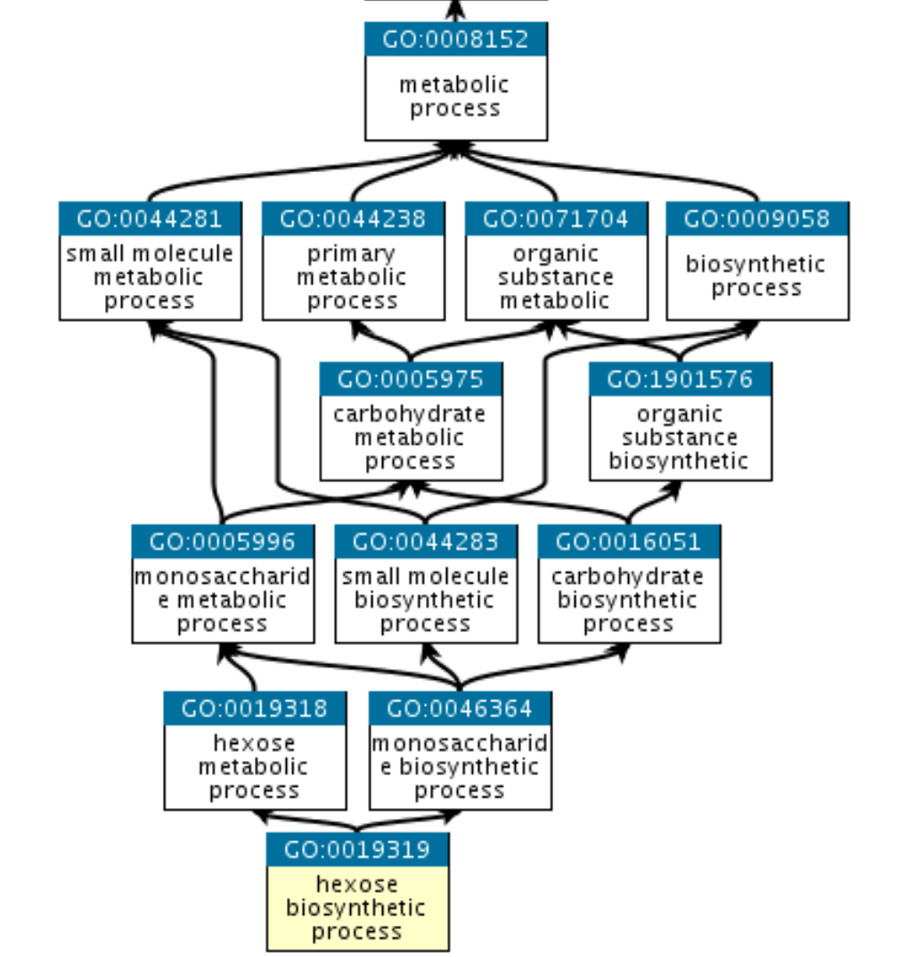
The ontologies are split into three categories
- (MF) Molecular Function: the molecular activities of individual gene products
- (CC) Cellular Component: where the gene products are active
- (BP) Biological Process: the pathways and larger processes to which that gene product’s activity contributes
The KEGG database also defines sets of genes. There is no defined relationship between KEGG pathways. There is however a complex network between genes belonging to the same pathway which does not exist in GO.
The choice of database does not actually affect how the statistical testing works. We test of significant collections regardless of how the collections have been defined.
The "cell cycle process" Gene Ontology has many hundreds of genes belonging to it. If we were to pick a set of genes at random of equivalent size as our list of differentially-expressed genes we should not be surprised to see a lot of cell-cycle genes appearing in the list. This is just due to the fact that we had a lot of possible cell-cycle genes to choose from. The key question is whether the number of cell-cycle (or any other pathway) is more than we would expect by chance.
In this section we will use the following files
background.csvcontaining one row for each gene in the comparison Basal.pregnant vs Basal.lactation (27,179 rows).B.preg_vs_lactation.csvcontaining one row for each found to be DE in the contrast Basal.pregnant vs Basal.Lactation.
It will be helpful to have both these files open in Excel.
There are two different approaches one might use, and we will cover the theory behind both. The distinction is whether you are happy to use a hard (and arbitrary) threshold to identify DE genes.
"Threshold-based" methods require definition of a statistical threshold to define list of genes to test (e.g. FDR < 0.01). Then a hypergeometric test or Fisher's Exact test is generally used. These methods require plenty of DE genes as an input, so people often use more-relaxed criteria for identifying DE genes (e.g. raw rather than adjusted p-values or FDR value but in conjuction with a fold-change cut-off)
The question we are asking here is;
"Are the number of DE genes associated with Gene Set X significantly greater than what we might expect by chance alone?"
We can answer this question by knowing
- the total number of DE genes
- the number of genes in the gene set (pathway or process)
- the number of genes in the gene set that are found to be DE
- the total number of tested genes (background)
You will never need to know this, but for those interested the formula for Fishers exact test is;
with:-
| Differentially Expressed | Not Differentially Expressed | Total | |
|---|---|---|---|
| In Gene Set | a | b | a + b |
| Not in Gene Set | c | d | c + d |
| Total | a + c | b +d | a + b + c + d (=n) |
As a worked example, consider a Gene Set with 634 genes. After performing differential expression, we find that our list of differentially-expressed genes comprises 4595 genes. Amongst this gene list, 233 belong to our Gene Set. Plugging-in the numbers we get:-
| Differentially Expressed | Not Differentially Expressed | |
|---|---|---|
| In Gene Set | 233 | 388 |
| Not in Gene Set | 4362 | 22196 |
Which yields a significant p-value with a Fishers' test.
Another way of thinking about this is to randomly pick a set of 4595 genes (i.e. without using a p-value cut-off) and see how many belong to our gene set.
The first time we do this, we get 100 genes in our set. The second time we get 112 and so on...
If we repeat enough time we can make a histogram:-

We see that a value of 233 is extremely unlikely. In other words, using our p-value cut-off to generate our gene list has resulted in about twice as many of our gene set than we would expect by chance
There are several popular online tools for performing enrichment analysis We will be using the online tool WebGestalt to perform the pathways analysis. It supports various types of analyses; the first of which accepts a list of pre-selected genes to perform an ORA.
- Go to https://www.webgestalt.org/#
- Choose the ORA Sample Run Tab

- Choose Organism:
Mus Musculus - Make sure that Method of interest is set to
Over-Representation Analysis (ORA) - Select Functional Database
geneontology
- you can change this later if you wish
- Keep Select Gene ID Type as
Gene symbol - Paste the gene symbols corresponding to DE genes in Basal pregnant vs Basal Lactation from your Excel spreadsheet into the Upload Gene List box.
- The shortcut CTRL + SPACE will let you select an entire column
- Do not paste the column heading
SYMBOL
- In Select Reference Set make sure genome protein-coding is selected.
- Click Submit
The page that appears can give a summary of the analysis performed (i.e. the number of genes that were used as input and how many names were recognised as valid gene names) along with various visualisations. The summary tab can be useful to check that you have supplied the correct kind of IDs (e.g. Gene symbol vs Ensembl, Entrez) and selected the correct organism. If few IDs are reported as being mapped, you should check your settings.
The bar plot shows the amount of enrichment for the pathways identified as being significant. A larger enrichment score indicates for a pathway indicates that genes are found in the list of gene names more than you would expect by chance. However, the pathways with the largest enrichment are not necessarily the most significant.

The table output shows details of the most over-represented pathways. Clicking on a pathway name in the left-hand column gives more information on the genes belonging to that pathway - including the names of genes in that pathway that were found in the list of genes. The Expect and Ratio columns indicate how many genes in a pathway that are expected to be found in the uploaded gene list, and how many more times genes in the pathway actually occur in the gene list. All columns in the table can be sorted.

::: exercise Exercise: Use WebGestalt to find enriched pathways in the Basal pregnant vs lactation analysis and take some time to understand the results. :::
This type of analysis is popular for datasets where differential expression analysis does not reveal many genes that are differentially-expressed on their own. Instead, it seeks to identify genes that as a group have a tendency to be near the extremes of the log-fold changes. The results are typically presented in the following way.

The "barcode"-like panel represents where genes from a particular pathway (HALLMARK_E2F_TARGETS in this case) are located in a gene list ranked from most up-regulated to most down-regulated. The peak in the green curve is used to indicate where the majority of genes are located. If this is shifted to the left or the right it indicates that genes belonging to this gene set have a tendency to be up- or down-regulated. The set of genes for a given pathway that contribute most to the enrichment are called the leading edge.
One reason for the popularity of this method is that it does not rely on having to impose arbitrary cut-offs on the data. Instead, we need to provide a measure of the importance of each gene such as it's fold-change. These are then used the rank the genes.
The Broad institute has made this analysis method popular and provides a version of GSEA that can be run via a java application. However, the application can be a bit fiddly to run, so we will use the Webgestalt website again
- Open the file
background.csvin Excel and delete all columns except theSYMBOLandbasal.lactationcolumn.
- Go to the Webgestalt website, and select GSEA Sample Run from the front page
- Check that Organism of interest is
Mus musculus - Make sure Method of interest is set to
Gene Set Enrichment Analysis (GSEA) - Select Functional Database as
geneontology- feel free to try other databases if you have time
- Make sure that Select Gene ID Type is
Gene symbol - Paste the contents of your modified excel file into the text box under Upload Gene List.

The results are presented in a similar way to the ORA from the previous section. However, the enrichment scores presented can either be positive or negative - indicating that genes from a given pathway tend to up- or down-regulated. Selecting a pathway from the Table of results or bar chart will given information about the enrichment of the pathway and the leading genes (set of genes in the pathway responsible for the enrichment).

::: exercise Exercise: Use Webgestalt to identify enriched pathways in the Basal Pregnant vs Lactation contrast. Compare the results from the most extreme positive and negative enrichment score, and make sure that you can interpret corresponding the barcode plots. :::